
Contact-sheet frame borders with film-orange accent for photographers.
Create a free account to customize and publish this design.
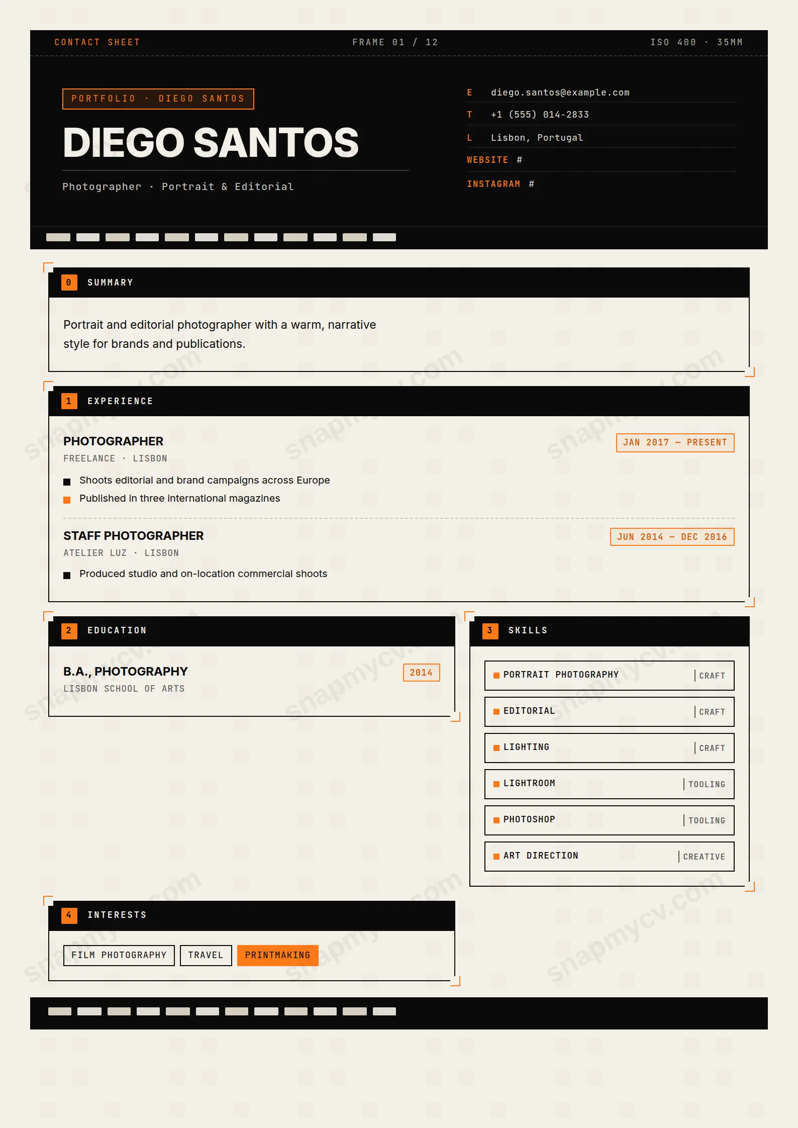
Contact-sheet frame borders and a film-orange accent wrap a layout that leaves your work room to breathe. Reads like a photo credit, not a spreadsheet.
Best for: photographers and visual artists. Free to fill in, restyle, download as a PDF, or publish at your own SnapMyCV link.
Applicant tracking systems: Visual only. Designed for human readers — heavy decoration, dark backgrounds or column layouts that often break ATS parsing.A template's styling never changes the advice that matters most — lead with achievements, quantify your impact, and tailor the content to each role.
New to writing a CV? Read our step-by-step CV guide and ATS tips, then come back and make this design your own.
Photographer borrows the visual grammar of a contact sheet and commits to it fully. The header is a band of film black (#0a0a0a) stamped with a monospaced leader bar reading CONTACT SHEET, FRAME 01 / 12 and ISO 400 - 35mm, with sprocket holes punched into warm paper (#f3efe6) along the top and bottom edges. Your name sets in heavy uppercase Inter at 40px, anchored by a kicker badge outlined in Kodak orange (#ff7a18), while contact details run down the right in JetBrains Mono, each line keyed E, T, L, W like a frame log scribbled on a roll. Inter and mono together do the real work: the display face keeps your name legible and modern, the monospace supplies the darkroom texture without turning the page into a novelty.
The body drops into a two-column grid where each section is a bordered frame with orange corner ticks, the crop marks you would pencil onto a proof. Every frame carries a black tab with a numbered orange chip and a monospaced title, summaries flow into two columns behind a drop cap, and bullet markers alternate ink-black and orange like adjacent exposures on a strip. The whitespace is deliberately tight and gridded rather than airy, so the page reads as an object that has been handled and marked up, not a form that was filled in. Restraint lives in the palette discipline: three colours only, black, warm paper and one orange accent, which stops the film conceit from tipping into clutter.
This template is right for working photographers, photo assistants, retouchers, videographers and visual storytellers whose craft is the whole pitch. The contact-sheet language rewards anyone who already thinks in frames, series and rolls, so it lands well for portfolio submissions, agency applications, gallery pitches and editorial cold outreach where a hiring manager expects a point of view on the page. If the reader is a creative director or a studio owner, the film-log styling signals fluency before they read a word.
It is the wrong choice if your work has nothing to do with images, or if the CV must pass through a strict corporate applicant tracking portal before a human sees it. The heavy framing, colour accents and two-column grid are exactly what a plain hiring pipeline strips or scrambles, and the darkroom metaphor reads as noise to a recruiter outside the visual industries. A finance analyst or a hospital administrator sending this would look like they missed the brief.
Feed the layout concrete, image-industry lines: campaigns shot, publications and mastheads carried, clients named, formats and cameras mastered. Put a genuine headline under your name, because it sets in monospaced type hard against a hairline rule and carries real weight, so a vague label wastes the strongest slot on the page. Keep the drop-capped summary to two or three sentences since it flows into two narrow columns and a long block turns grey and dense fast. Use the square skill badges for real tools and disciplines only, Capture One, medium format, colour grading, and stop before the badges wrap into filler that dilutes the strong ones.
The commonest mistakes are overfilling the numbered frames until the crop-mark borders collapse into a wall of text, and leaving the E, T, L, W contact log half-empty so the mono column looks broken. Fill all four keys, and use W and L to point straight at your website and Instagram so the document links to the work it describes. Because every section is a fixed frame on a two-column grid, aim for balanced blocks: three to five tight bullets per role, alternating black and orange markers, rather than one frame that runs long and another that sits nearly empty.
Mostly yes, because the design leans on structure rather than colour to carry hierarchy. In greyscale the #ff7a18 orange corner ticks, numbered chips and alternating bullets drop to a mid grey, so they read as tone rather than accent, but the film-black header, the monospaced tabs and the bordered frames keep every section clearly separated. You lose the darkroom warmth of the paper-and-orange palette, yet the page stays legible and correctly ordered on a black-and-white printer.
It is built for a focused one-page story, not an exhaustive history. The numbered frames on a two-column grid comfortably carry a headline summary, six to eight skill badges, three or four roles and a short education or credits block before the grid feels crowded. Photographers with a long client list are better served naming the strongest campaigns and publications and letting the linked website and Instagram carry the deep archive.


