
Classic academic CV with Garamond-style serif for university professors.
Create a free account to customize and publish this design.
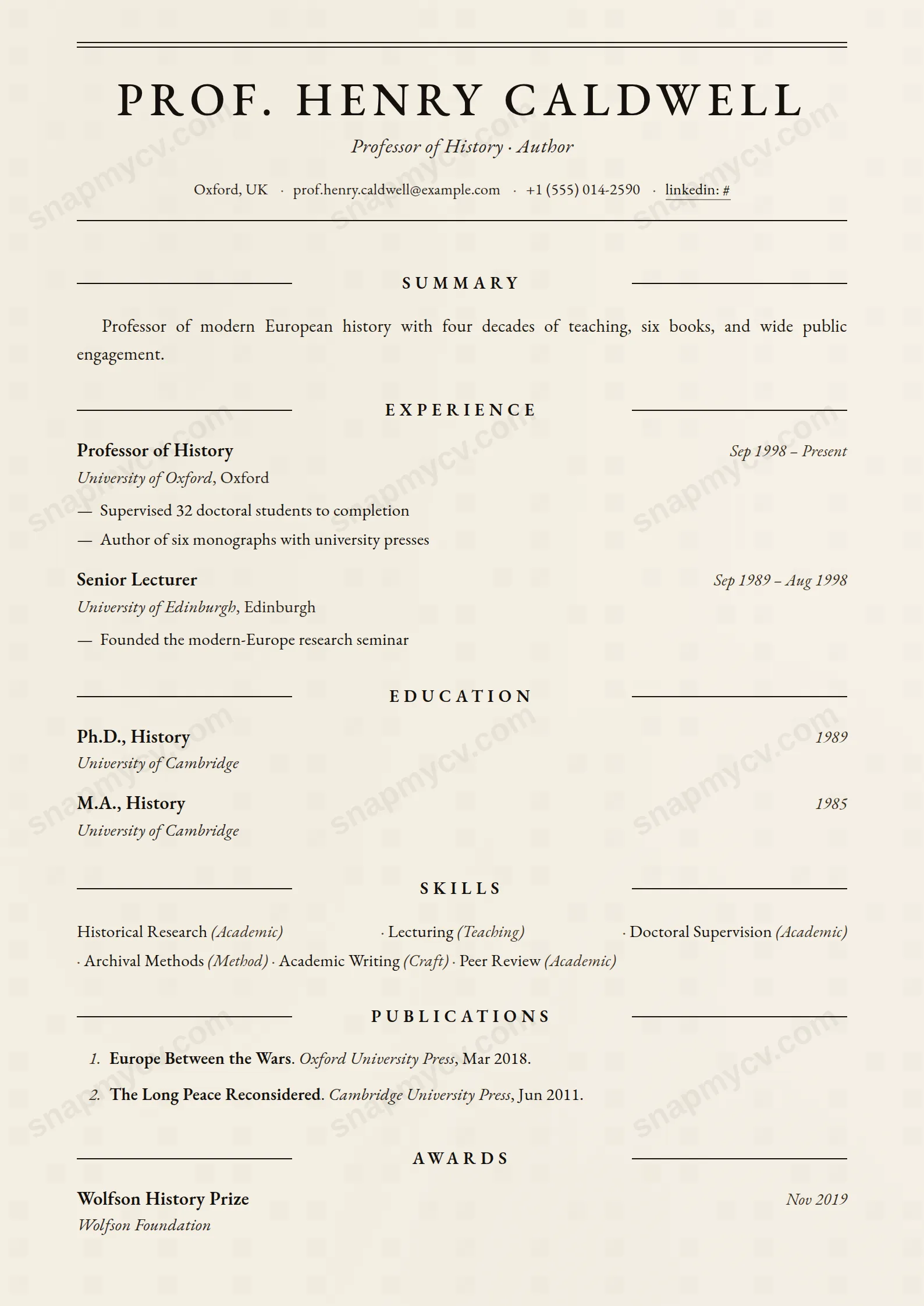
A classic academic CV in Garamond-style serif with proper space for publications, grants, supervision, and service — the long-form record academia actually requires.
Best for: professors, lecturers, and academic researchers. Free to fill in, restyle, download as a PDF, or publish at your own SnapMyCV link.
Applicant tracking systems: ATS-friendly. Single-column, standard section headers, parses cleanly in most applicant tracking systems.A template's styling never changes the advice that matters most — lead with achievements, quantify your impact, and tailor the content to each role.
New to writing a CV? Read our step-by-step CV guide and ATS tips, then come back and make this design your own.
The whole page is built to feel printed rather than exported. Warm cream (#f6f1e6) carries ink-black text (#14110d), and a faint two-point gradient wash sits underneath to suggest paper stock, so the result reads like a journal offprint instead of a screen document. EB Garamond does the heavy lifting: old-style numerals that dip below the baseline, proper ligatures, and a book-weight rhythm that stays legible across a long record. Nothing about the palette shouts. The contrast is deliberately soft, which keeps a dense page from feeling aggressive.
Structure comes entirely from typography, not colour or panels. Your name is centred in spaced uppercase at 30pt, capped by a heavy double rule and closed underneath with a hairline, with an italic headline directly below. Section titles are centred small caps, widely tracked, flanked left and right by thin rules that meet in the middle like a chapter break. Body copy is justified and hyphenated the way a printed article is, experience bullets carry an em-dash marker, and publications drop into a numbered, tightly set list with italic titles and publisher notes. The hierarchy is quiet, formal, and made to hold volume.
This is a curriculum vitae, not a resume, and it behaves like one. It is genuinely right for professors, postdocs, lecturers, principal investigators, and research clinicians whose careers are measured in publications, grants, awards, and years of teaching. The numbered publications block is the centrepiece, with space for titles, venues, dates, and short annotations, and the single column lets that list run for pages without fighting a sidebar. If your value is a documented scholarly record, the format flatters it.
Be honest about who should walk away. A designer, product manager, sales lead, or new graduate selling on impact and brevity will look underdressed here: the justified cream page and small-caps rules signal tradition, and a thin one-page career leaves the layout looking half-empty. Anyone applying through fast-scanning corporate recruiters or a modern startup will read as out of step. The style rewards a full record and punishes a sparse one.
Write for justification. Because the body is justified and hyphenated, full measured sentences set cleanly while short ragged fragments open ugly rivers of white space between words, so favour complete phrasing in your summary and bullets over clipped one-liners. Use the italic headline for field and rank (for example, Professor of Molecular Biology), keep institution names and dates exact since the small-caps section rules leave nowhere to hide inconsistency, and let each experience entry run a few full lines rather than terse dashes. Order sections so the strongest evidence, usually publications and grants, sits high on the page.
Treat the numbered publications list as the document's spine and give it real length: titles in italic, venue and publisher, year, and a one-line annotation where a paper needs context. Do not trim citations to save space, since this template is designed to absorb a long list, and do not pad thin sections like hobbies or custom fields just to fill the column. The most common mistake is bringing resume habits to a CV form, forcing everything onto one page and leaving the justified body and centred rules looking starved. Let it breathe across multiple pages as an academic record should.
The single column and conventional headings parse well, but the justified text, cream background, em-dash bullet markers, and dense numbered citations can trip stricter parsers. Most academic and university hiring runs through committees and human review rather than aggressive keyword filters, which suits this format. If you must submit through an online portal, paste the rendered CV into a plain-text editor first and confirm every citation, date, and section survives intact.
Very well, because the design barely relies on colour to begin with. The warm cream (#f6f1e6) drops to a light neutral and the ink-black text (#14110d) stays crisp, so all the structure that matters, the double rule under your name, the small-caps section rules, and the numbered publications, comes through unchanged. This is one of the few templates that looks almost identical photocopied or faxed, which fits how academic records still circulate.


