
WHO-inspired infographic style for public health professionals.
Create a free account to customize and publish this design.
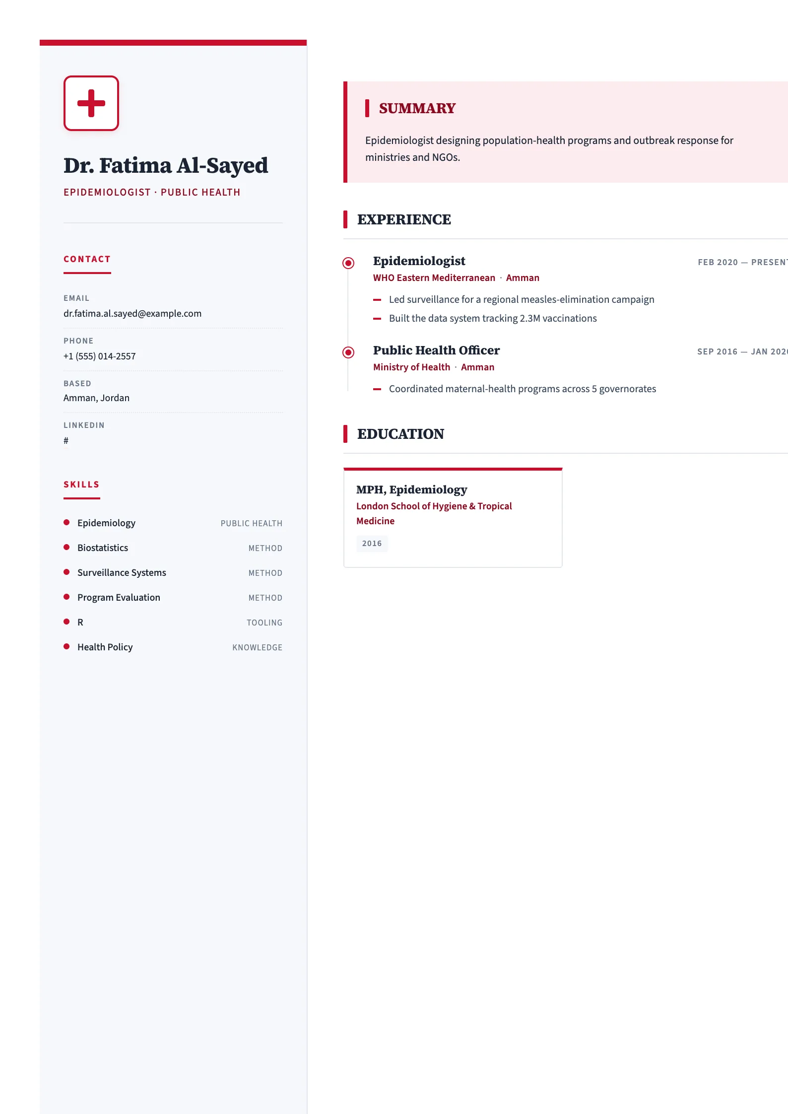
Infographic-leaning sections inspired by WHO reports: interventions, populations served, and outcomes presented with field-report clarity.
Best for: public health professionals and NGO program staff. Free to fill in, restyle, download as a PDF, or publish at your own SnapMyCV link.
Applicant tracking systems: Light styling. Mostly parseable but uses sidebars, columns or visual elements that may confuse stricter ATS.A template's styling never changes the advice that matters most — lead with achievements, quantify your impact, and tailor the content to each role.
New to writing a CV? Read our step-by-step CV guide and ATS tips, then come back and make this design your own.
Public Health commits to a single visual idea and executes it with discipline. A 270px sidebar in soft slate-blue (#f6f8fb) runs against a clean white main column, and a 6px crimson (#c8102e) bar caps the sidebar so the eye lands top-left before it travels. The framed red-cross emblem sitting above your name is the piece that separates this from any generic two-column resume: it signals clinical and humanitarian work in a single glance, before a word is read. Typography splits the labour deliberately. Source Serif 4 gives your name, section titles, and role headings a measured, institutional weight, while Source Sans 3 keeps dense body text crisp and legible down to small sizes, which matters when a field CV has to hold coverage figures and long programme names.
The layout's real ambition is to make each section read like its own small diagram rather than a wall of text. Experience and volunteering descend a red-dotted timeline with circular markers, so a career spent moving between postings and grant cycles reads as a clear vertical sequence. Education is built as a two-up grid of stat cards with crimson top-borders and GPA chips, publications carry numbered leading-zero badges, and the summary is lifted into a tinted mission panel (#fdecef) with a deep-red left rule. Red tick marks flag every heading. The effect is infographic but never loud, because colour is rationed to accents and the white column does most of the breathing.
This is a sector CV, and it earns its keep for people inside public health: epidemiologists, community and outreach health workers, programme officers, health policy analysts, biostatisticians, nurses stepping into population health, and NGO or ministry staff. The sidebar is organised around what this field actually screens for, with dedicated blocks for certifications, languages, and skills, so an MPH credential, field-language fluency, or GIS and surveillance tooling all sit where a reviewer expects them. The dotted timeline specifically rewards a portfolio career of projects, deployments, and funding rounds rather than one long tenure.
Be honest about where it works against you. The red-cross emblem and crimson palette are semantically loaded, so if you are pivoting into finance, corporate strategy, product, or any field with no clinical or humanitarian read, the branding will feel costume rather than credential. It also assumes you have real sidebar substance: someone early in their career with few certifications and one language will leave the slate-blue column looking hollow next to a full main stream. If that describes you, a template without a heavy sidebar dependency will flatter you more.
Feed the two columns with different kinds of content. The slate-blue sidebar wants short, scannable atoms: certifications (MPH, field-epidemiology or GCP training), languages with honest proficiency levels, and tight skill labels. Resist writing sentences here, because long strings break the dotted rhythm and push the sidebar out of balance with the main column. The tinted mission panel is a single line of prime real estate, so use it for one sharp statement of your public-health focus, not a paragraph. Under each timeline role, spend your bullets on quantified reach: vaccination coverage, caseloads, population served, districts covered, budget managed. This template is designed to showcase numbers, and vague duty statements waste its best feature.
Mind the structural quirks. Education renders as paired stat cards, so two or four entries balance the grid cleanly while three leaves an orphaned card, and the leading-zero publication badges look intentional only when you have a genuine list rather than one lonely citation. The most common mistake is treating the mission panel and summary as room for a long narrative, which crowds the deep-red rule and shrinks the timeline below it. Keep the summary to two or three lines, hold each role to three or four impact bullets, and let the white space the design builds in do its work instead of filling every gap.
It degrades gracefully because the design never relies on colour alone to carry structure. The crimson top bar, red-dotted timeline, and #fdecef mission panel all drop to light and mid greys, but the 270px sidebar, the framed emblem, the card borders, and the leading-zero badges keep their shapes, so hierarchy survives. The one thing to watch is the pale slate-blue sidebar tint, which can wash out to near-white on a low-quality photocopier, leaving the two columns divided by spacing rather than shade.
For a pure bedside clinical role where one licence and local practice are the whole story, the credential-heavy sidebar can look more elaborate than the job asks for. It comes into its own for population-health, NGO, ministry, and multi-site roles where certifications, field languages, and cross-project history are genuine selection criteria. If your value is a single strong specialism rather than a spread of credentials and postings, a simpler single-column layout will present that focus more directly than this infographic structure.


