
ISO-style tables with checkmark accents for quality and industrial engineers.
Create a free account to customize and publish this design.
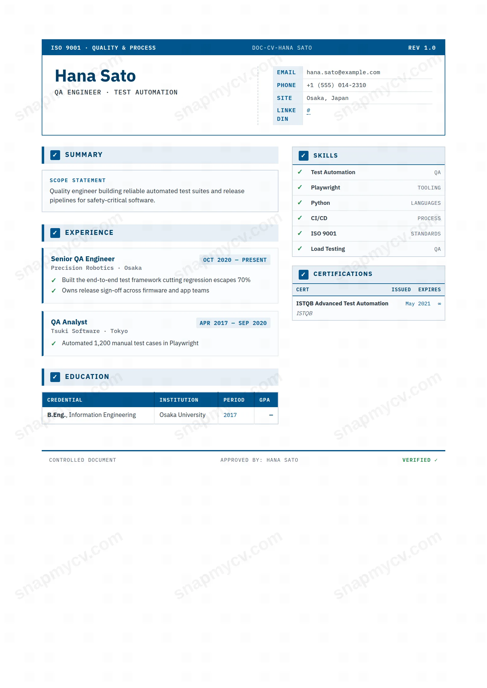
ISO-flavored tables, checkmark accents, and a structure that reads like a well-written test plan. Your attention to process is visible in the formatting before it's stated in the bullets.
Best for: QA engineers and quality/compliance specialists. Free to fill in, restyle, download as a PDF, or publish at your own SnapMyCV link.
Applicant tracking systems: Light styling. Mostly parseable but uses sidebars, columns or visual elements that may confuse stricter ATS.A template's styling never changes the advice that matters most — lead with achievements, quantify your impact, and tailor the content to each role.
New to writing a CV? Read our step-by-step CV guide and ATS tips, then come back and make this design your own.
The QA Engineer template borrows the grammar of a quality management system and applies it, without irony, to a resume. A deep-blue certification strip runs across the top like a document control header, stamped with an ISO 9001 mark, a DOC-CV reference and a REV 1.0 revision tag in IBM Plex Mono, while your name sits beside it in heavy IBM Plex Sans over a monospaced contact table. The pairing is deliberate: the mono typeface signals machine-checkable precision, the sans gives the human name weight and authority. Colour is rationed rather than spent. One signposting blue, #00558c, deepens to #003e66 for structure, soft #e6eff6 panels carry supporting blocks, slate-grey handles body text, and a single green, #1f8a4c, is held in reserve for the tick marks alone.
That restraint is what sells the metaphor. Because green appears only on the check badges beside each heading and the ticks that lead every experience and project bullet, those ticks read as passed test cases rather than decoration. The professional summary is reframed as a Scope Statement, education and awards drop into bordered data tables with monospaced date columns and zebra-striped rows, and the page signs off in the footer as a Controlled Document marked Approved and Verified. The two-column grid, a wide narrative main column against a fixed 250px sidebar, keeps the whole thing looking audited instead of styled, which is exactly the impression a test professional wants to leave.
This layout is genuinely aimed at QA and test engineers, SDETs, automation and performance specialists, and quality or compliance leads whose credibility rests on rigour, traceability and evidence. If your work lives in test plans, coverage metrics, CI pipelines and certification numbers, the document-control framing flatters it: the sidebar checklist table sorts tools and frameworks by category, and the certifications table with issued and expiry columns is purpose-built for ISTQB, CSTE or cloud credentials that carry dates.
Be honest about who it fights. A designer, marketer, founder or anyone selling narrative and personality will find the deliberately clinical blue-and-mono system works against them, and career changers with little to put in the metrics-heavy ticked lists will leave the structure looking empty. It also assumes a real body of quantifiable results; if you cannot fill the tables and checklists with concrete tools, dates and outcomes, the framework exposes the gaps rather than hiding them. Choose it because your discipline is the selling point, not in spite of it.
Treat every structural feature as a slot with a job. Write the Scope Statement as a tight declaration of what you own and cover, not a personality paragraph, then load the main column with ticked highlight lists that lead on measurable outcomes: defect escape rate, automation coverage, mean pipeline run time, releases shipped. Because each bullet opens with a green tick, phrase it results-first so it reads as a verified win rather than a duty. Push tools and frameworks into the 250px sidebar checklist grouped by category, and reserve the certifications table for credentials that actually have issued and expiry dates so those monospaced columns stay populated.
The common mistake is writing for a plain layout and pasting it in. Long unbroken paragraphs collapse the grid and drown the tables, so keep entries concise and quantified; the bordered, zebra-striped tables and blue panels look sharpest with short, scannable rows. Aim for roughly three to five ticked bullets per role, a two or three line Scope Statement, and enough sidebar and certification entries to balance the narrow column against the wide one. If a section runs thin, tighten it rather than padding, because empty tables read as loudly here as full ones do.
The headings use standard labels like Experience, Education, Skills and Certifications, and all the text is real selectable content, which helps. But this is a colour-and-table-heavy two-column design, and some applicant tracking systems read multi-column or tabular layouts in an unpredictable order. Paste your finished CV into a plain-text editor and confirm everything lands in a sensible sequence before you submit to a strict system.
It survives better than most coloured templates because the design never relies on hue alone to carry meaning. The #00558c and #003e66 blues flatten to distinct dark greys that still separate the header strip and panels, and the #1f8a4c ticks keep their shape as check marks even without colour, so bullets still read as passed items. The monospaced date columns and zebra striping in the tables also stay legible, meaning a black-and-white print keeps the audited, structured look intact.


