
Understated and refined template for seasoned professionals.
Create a free account to customize and publish this design.
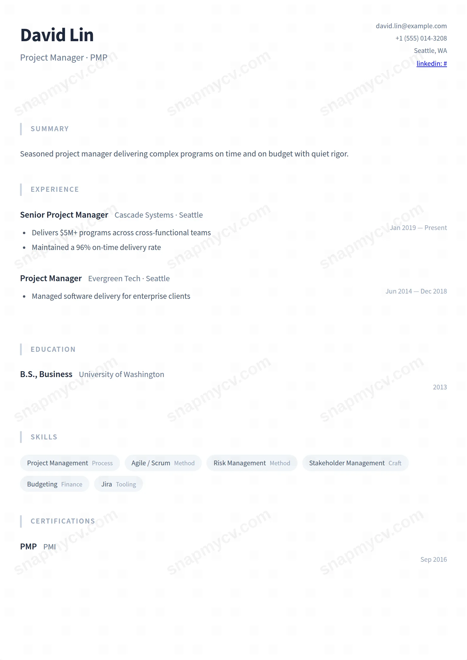
Understated typography, generous margins, and zero theatrics. For careers substantial enough that the page only needs to stay out of the way.
Best for: seasoned professionals and senior individual contributors. Free to fill in, restyle, download as a PDF, or publish at your own SnapMyCV link.
Applicant tracking systems: ATS-friendly. Single-column, standard section headers, parses cleanly in most applicant tracking systems.A template's styling never changes the advice that matters most — lead with achievements, quantify your impact, and tailor the content to each role.
New to writing a CV? Read our step-by-step CV guide and ATS tips, then come back and make this design your own.
Quiet Professional runs everything through Source Sans Pro, a humanist sans built for long-form reading, and holds the whole document to a single 800px column floating on a soft #f8fafc field. That choice is doing real work. With no sidebar, no photo well and no colour banner, the eye has only one path down the page, so a recruiter reads your career in the order you wrote it rather than bouncing between panels. Body copy sits in muted slate #334155 while names step down to a deeper #1e293b, a two-tone hierarchy that separates who you are from what you did without a single bold rule shouting for attention.
The section furniture is where the restraint becomes deliberate. Titles are set small, uppercase and widely letter-spaced in pale #94a3b8, anchored by a thin #cbd5e1 line on the left instead of a filled header block, so structure registers as a whisper rather than a heading bar. Skills arrive as soft #f1f5f9 pills, dates drift quietly to the right of each role, and the header splits your name left against right-aligned contact lines. Every one of these micro-decisions trades visual drama for legibility, which is the point: the palette is deliberately low-contrast so nothing on the page competes with your sentences.
This template is right for people whose credibility is built on reliability rather than flourish: accountants, analysts, auditors, engineers, researchers, civil servants, and healthcare or operations staff working inside measured corporate and academic cultures. The quiet slate palette reads as composure in those rooms, and the single column carries a full set of blocks, summary, experience, education, skills, projects, certifications, languages, awards, publications, volunteering and custom sections, so a long, evidence-heavy career fits without visual strain.
Be honest about who should walk away. If you are a designer, brand marketer, or creative director whose portfolio needs to signal visual range, this understated grey document will read as flat and undersell you. The same goes for anyone chasing roles where personality and boldness are the hire: there is no accent colour, no photo and no graphic device here to project that. Choose Quiet Professional when the job rewards substance over presentation, not when the presentation is the substance.
Because there is no sidebar or graphic to fill, the writing has to carry the page, and the layout rewards a specific order. Lead with a tight three or four line summary directly under the left-aligned name, then let experience dominate the middle of the column with each role earning its space through concrete, number-driven bullet highlights rather than lists of duties. Use the right-floating dates as the scan anchor for your timeline, keep job titles crisp so the #1e293b name-weight hierarchy stays clean, and place the sections that prove your track record, experience and certifications, high before education, projects and the optional blocks trail below.
Treat the #f1f5f9 skill pills with discipline: they are meant to be a scannable dozen genuine terms, not a wall, and stuffing the row is the single most common way people break this design. The other frequent mistake is fighting the calm by cramming every block full until the generous #f8fafc spacing disappears, which erases the exact quality the template sells. Aim for one page for early careers and two for senior ones, trust the whitespace, and let a shorter, sharper document read as confidence rather than gaps to be filled.
It is one of the safer choices for parsing. The single-column flow, conventional headings like Experience and Education, and real selectable text with no images give an ATS a clean, top-to-bottom read, and the #f1f5f9 skill pills are pure styling that flattens to plain text underneath. Greyscale printing is a non-issue precisely because the whole palette is already near-grey: the slate #334155 body, #1e293b names and pale #cbd5e1 rules were low-contrast to begin with, so a black-and-white printout looks almost identical to the screen.
For steady-hand leadership, operations, finance and academic tracks it reads as composure, not timidity, and the deeper #1e293b name weight plus the wide-set uppercase section titles still give a senior document clear authority. Where it genuinely underdelivers is roles that hire on visible boldness or creative flair, since there is no accent colour or graphic device to project ambition. If your seniority is measured in judgement and results rather than presence, the restraint is an asset.


