
Two-column layout with a strong colored sidebar accent.
Create a free account to customize and publish this design.
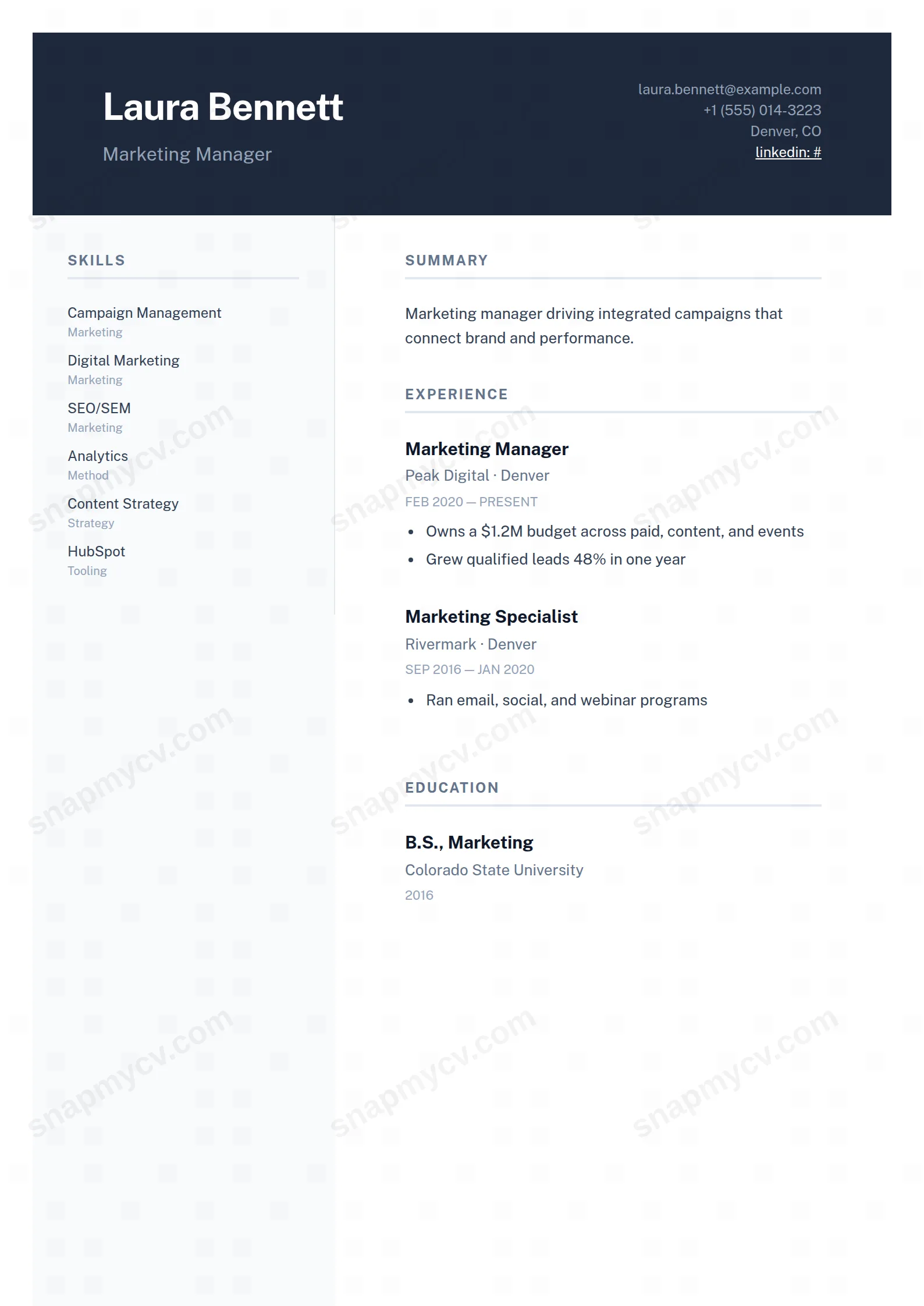
A strong colored sidebar carries contact, skills, and languages while the main column stays free for experience. The classic two-column workhorse, executed cleanly.
Best for: general professional use across industries. Free to fill in, restyle, download as a PDF, or publish at your own SnapMyCV link.
Applicant tracking systems: Light styling. Mostly parseable but uses sidebars, columns or visual elements that may confuse stricter ATS.A template's styling never changes the advice that matters most — lead with achievements, quantify your impact, and tailor the content to each role.
New to writing a CV? Read our step-by-step CV guide and ATS tips, then come back and make this design your own.
Sidebar Accent is built on two structural decisions that carry the whole design. First, a full-width slate header (#1e293b) anchors the top of every copy, setting your name in heavy 32px Public Sans against a muted blue-grey subhead, with contact details tucked quietly to the right so the band reads as a masthead rather than a box of labels. Second, a fixed 260px left rail sits on a soft #f8fafc wash that repeats down every printed page, which means a three-page history never loses its spine or drifts into a wall of undifferentiated text.
The accent is architectural, not decorative. Section titles are set in uppercase, tracked-out #64748b over hairline #e2e8f0 rules, so hierarchy comes from spacing and weight instead of colour blocks. Skills stack as compact badges that can carry a small grey sub-label, languages list with proficiency, and hobbies resolve into rounded slate tags. The wider main column stays a calm slate-on-white, which is deliberate: the eye should travel the narrative in the main column and dip into the rail only to confirm a fact.
This template earns its keep when you carry two payloads at once: a long narrative of roles and projects, and a dense supporting inventory of skills, languages, certifications and awards. Software engineers, data and BI analysts, product managers, performance marketers and operations leads are the natural fit, because the rail lets a deep toolkit sit visible at a glance without elbowing the story out of the main column.
It is the wrong choice if you are early-career or changing fields with little to file in the rail, because a half-empty 260px column reads as thin rather than considered. It also fights formats that expect a single clean text stream, such as strict academic CVs or roles that mandate a plain one-column PDF. If your value is one strong narrative with almost no supporting metadata, a single-column template will look more intentional than this one.
Treat the two columns as different registers. The rail wants short, scannable atoms: skill names of one or two words, honest proficiency levels on languages, certifications that actually signal something, and a handful of tags rather than a paragraph. Resist writing sentences in the rail, because the badge and tag styling is tuned for terse labels and long strings wrap awkwardly against the 260px width. The main column is where outcomes live: lead with your summary, then run experience, education, projects and publications, and use the bullet highlights under each role to carry numbers and impact.
The common mistake is inverting this, stuffing narrative into the sidebar and leaving the main column as bare job titles, which flattens the hierarchy the design depends on. Aim for a three to four line summary, three to five bullets per recent role tapering to one or two for older ones, and enough rail content to fill roughly the header-to-footer height on page one. Because the layout leans on hierarchy rather than ornament, tight and specific writing is what makes it read senior.
The markup is clean semantic text with standard section headings, so most modern parsers handle it well. But it is a genuine two-column design with a coloured header and a shaded rail, and some stricter systems flatten columns and may read the sidebar out of order. As a quick check, paste the rendered CV into a plain-text editor: if the rail and main column still read sensibly top to bottom, you are safe to apply.
Yes. The design was built on tonal contrast rather than hue, so the #1e293b header, the #f8fafc rail wash and the #64748b titles all separate cleanly as distinct greys on a black-and-white printer. Nothing in the layout relies on a reader distinguishing colours, which is why the header still reads as a solid dark masthead and the rail stays visibly recessed even in a monochrome photocopy.


