
Call-stack inspired layout with indent hierarchy for backend developers.
Create a free account to customize and publish this design.
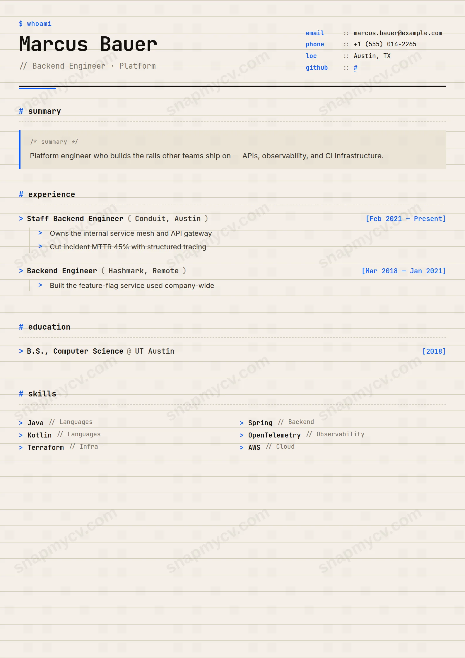
An indent hierarchy inspired by a call stack — experience nests logically, and a reviewer can pop frames to exactly the depth they care about. Quietly funny, completely readable.
Best for: backend and systems developers. Free to fill in, restyle, download as a PDF, or publish at your own SnapMyCV link.
Applicant tracking systems: Visual only. Designed for human readers — heavy decoration, dark backgrounds or column layouts that often break ATS parsing.A template's styling never changes the advice that matters most — lead with achievements, quantify your impact, and tailor the content to each role.
New to writing a CV? Read our step-by-step CV guide and ATS tips, then come back and make this design your own.
Stack Trace commits to one idea and executes it cleanly: your career, rendered as source you could read in a terminal. Setting the whole page in JetBrains Mono on a warm paper ground (#f4efe6) with a faint horizontal grid is not nostalgia for green screens, it is a legibility choice. Monospace figures align, so the right-hand `[date, date]` ranges sit in a perfect column of tabular numbers and the `email :: value` header rows read like aligned key-value pairs rather than a scattered contact block. The lowercase `$ whoami` prompt and the `//` before your headline set an unmistakable tone in the first inch of the page.
The colour discipline is what keeps it from becoming a novelty. Ink-black type does almost all the work; the electric-blue (#0b5bff) shows up only as the closing header tick and the `>` arrows that open each role, and orange (#ff5b1f) is quarantined to the brackets around project tech stacks. Two accents, each with one job, against warm paper. The single deliberate compromise is smart: body descriptions quietly switch from mono to Inter, so a three-line bullet stays comfortable to read while the structural furniture stays in code voice. Hierarchy comes from `#` section markers and dashed underlines rather than heavy rules, which keeps the whitespace calm.
This template earns its keep for people who write code and want the page to prove it before a recruiter reads a line: backend and frontend engineers, SREs, data and platform folk, and technical founders. The trace format flatters real function-like roles, named tools inside the orange brackets, and outcome bullets, so it is at its best when you have specifics to pour into that structure.
Be honest about where it misfires. The prompts, arrows and call-stack entries are a strong metaphor, and outside technical roles they read as costume. Non-developers, and anyone applying into conservative finance, law, healthcare or senior executive tracks, will look better in something neutral. Even for engineers, a purely managerial CV with no tools or shipped systems leaves the orange brackets empty and wastes the design.
Map your content to the structure the layout expects. Fill the header meta as clean `email :: value` rows and include a website plus one or two social links; a GitHub URL reads especially well here. Give each role a tight, function-like title, put the company in the parenthesised arguments, and let the right-aligned tabular dates carry the timeline. Lead every `>` bullet with a measurable outcome, not a responsibility, and drop honest tool names into the orange project brackets. Reserve the `#`-tagged skill and hobby tokens for genuine signal, and set language proficiencies you can defend.
The common mistake is padding. The call-stack rhythm exposes filler instantly, so a vague four-line bullet looks worse here than on almost any other template. Keep the summary in its left-bordered frame to two or three sentences, hold most bullets to a single line, and aim for three or four bullets per recent role. Let the verbs and numbers shout; the warm paper and restrained accents are engineered to stay quiet behind them.
No, because the `$`, `#`, `>` and `//` marks are styling on top of ordinary text, and the document is a single column of real text rather than images. A parser reads your name, roles, dates and bullets in order and simply ignores the decorative symbols. As a check, copy the rendered CV into a blank document and confirm every entry survives in sensible order before you apply.
It holds up well because the design never relies on colour to carry meaning. The structure comes from JetBrains Mono weight, the `#` section markers and dashed underlines, so in greyscale the blue `>` arrows and orange tech brackets simply become dark grey and the hierarchy stays intact. Nothing becomes ambiguous or unreadable on a black-and-white office printer.


