
Sterile surgical aesthetic with steel-blue precision for surgeons.
Create a free account to customize and publish this design.
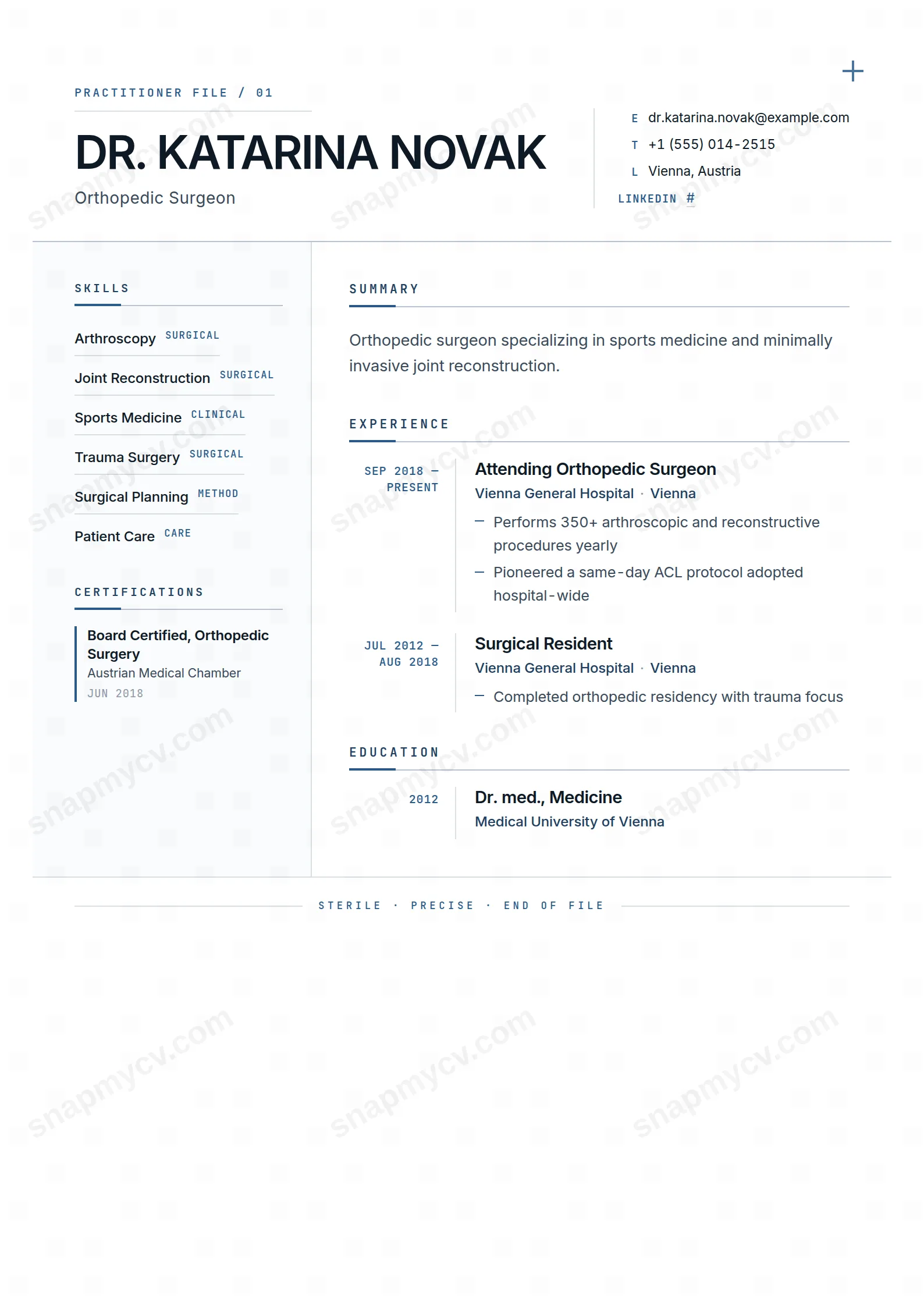
A sterile, steel-blue aesthetic with nothing decorative left on the table. Procedures, privileges, and training read with operating-room economy.
Best for: surgeons and hospital consultants. Free to fill in, restyle, download as a PDF, or publish at your own SnapMyCV link.
Applicant tracking systems: Light styling. Mostly parseable but uses sidebars, columns or visual elements that may confuse stricter ATS.A template's styling never changes the advice that matters most — lead with achievements, quantify your impact, and tailor the content to each role.
New to writing a CV? Read our step-by-step CV guide and ATS tips, then come back and make this design your own.
Surgeon Sharp treats the page as a clinical file rather than a marketing document, and every choice serves that fiction. The palette holds itself to sterile white (#ffffff) and a faint paper grey (#fafbfc) for the sidebar field, with near-black ink (#0e1a26) doing the reading and a single disciplined steel-blue (#2a5b8a, deepening to #1e3f60) rationed out to accents. Nothing is decorative for its own sake. The steel cross in the top-right of the header, the 'PRACTITIONER FILE / 01' eyebrow and the 'STERILE, PRECISE, END OF FILE' footer bracket the document like intake and sign-off stamps, so the whole CV reads as one sealed record.
The typography is where the precision actually lives. Inter sets the name in uppercase at 30pt with very tight kerning, giving a hard, engineered nameplate, while JetBrains Mono runs every label, date, skill category and section heading in spaced uppercase for an instrument-panel exactness. Structure reinforces it: a 40px steel underscore anchors each section title, a hairline rule divides the 220px sidebar from the main column, experience dates sit on a right-aligned monospace rail, and ordinary bullets are swapped for short steel dashes. The result is high-contrast and airy, a layout that reads as calibrated rather than styled.
This is a template for people whose credibility rests on rigour and verifiable fact. Clinicians are the obvious core: surgeons, physicians, dentists, anaesthetists, nurses and allied health staff, whose licences, board certifications and caseloads slot naturally into the sidebar's categorised skills and dated certifications blocks. It extends cleanly to engineers, research scientists, biostatisticians and anyone who leads with publications, procedures and measured outcomes. The main column's summary, experience, education, publications and awards run reads like a dossier assembled for a credentialing committee.
Be honest about who it fights. If your value is warmth, storytelling or brand personality, this is the wrong instrument. Client-facing creatives, marketers, hospitality and early-career applicants with thin credentials will find the monospace labels and sterile whitespace exposing rather than flattering, because the layout amplifies exact detail and mercilessly reveals its absence. The uppercase, all-caps register also reads as cold in fields that expect a human voice. Choose it when precision is the message, not when connection is.
Sort your content by column before you write. The 220px sidebar is engineered for discrete, atomic facts: skills grouped under short category headers, certifications paired with their issuer and date, and languages scored against the thin proficiency rules. Keep each of these to a few words so they never wrap awkwardly against the hairline divider. The main column carries the narrative weight, so put the two or three line summary, the dated experience entries, education, and any publications or awards there. Because experience dates ride a right-aligned monospace rail, format them consistently (a plain year range works best) or the rail loses its clean vertical edge.
The spare layout rewards numbers over adjectives, so lean into caseloads, procedure counts, outcome rates and dates instead of soft descriptors. Two common mistakes sink this design: overstuffing the sidebar until categorised skills collapse into a grey wall, and writing sentence-case labels that clash with the deliberate uppercase system. Use the steel-dash bullets for three to five tight lines per role, not paragraphs, and keep capitalisation uniform throughout so the Inter nameplate and JetBrains Mono labels stay crisp. If you have no publications, drop the block rather than padding it, since visible emptiness reads as a gap in a file this formal.
The headings are conventional and the markup underneath is ordered text, so most modern applicant tracking systems read it cleanly. The risk is the 220px sidebar: some older parsers flatten columns and may interleave your certifications or languages with the main column out of sequence. Before submitting through a strict hospital or government portal, copy the rendered CV into a plain text document and confirm every role, date and credential still reads in the right order.
It holds up well because the design never relies on colour to carry meaning. The steel-blue (#2a5b8a) accents, the header cross and the section underscores all drop to a mid-grey that still contrasts against the white and paper-grey fields, and the structure is defined by hairline rules, spacing and the monospace date rail rather than hue. A black-and-white print or fax stays fully legible, which suits the clinical and credentialing contexts this template targets.


