
Inspired by Swiss design principles — grid-based, typographic, precise.
Create a free account to customize and publish this design.
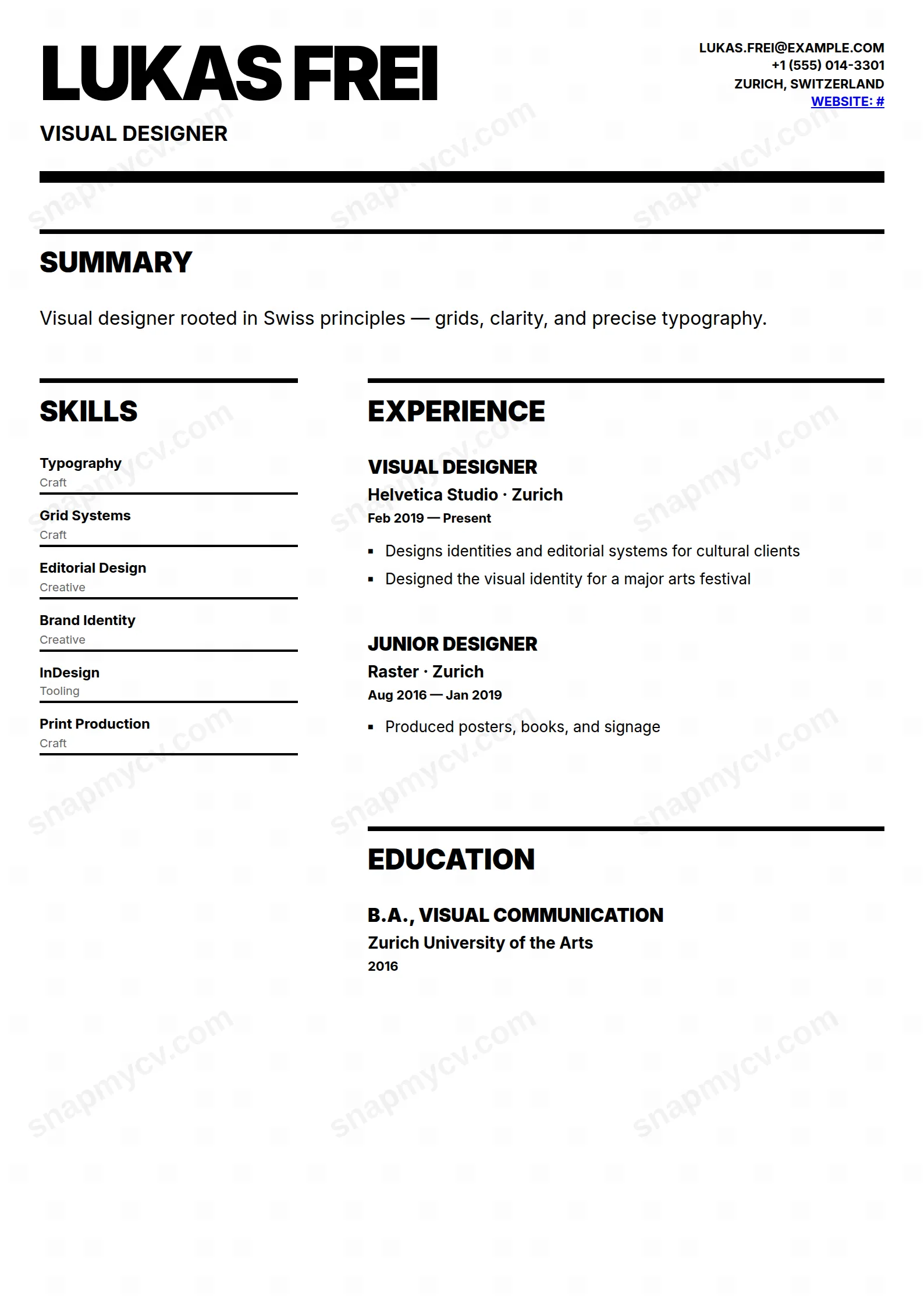
Grid-based, typographic, ruthlessly clear — International Style applied to a CV. No ornament, maximum hierarchy, the design choice that signals you know design history.
Best for: designers and minimalists across industries. Free to fill in, restyle, download as a PDF, or publish at your own SnapMyCV link.
Applicant tracking systems: ATS-friendly. Single-column, standard section headers, parses cleanly in most applicant tracking systems.A template's styling never changes the advice that matters most — lead with achievements, quantify your impact, and tailor the content to each role.
New to writing a CV? Read our step-by-step CV guide and ATS tips, then come back and make this design your own.
Swiss Style commits fully to the International Typographic Style, so there is no colour and no ornament anywhere. It is pure black on white, and every effect comes from weight, scale, and alignment rather than decoration. The entire CV is set in Inter, a neutral geometric sans that keeps the tone rational and contemporary. Your name is the loudest note on the page, set at 64px in the heaviest 900 weight, uppercase, with tight negative letter-spacing so the characters pack together like a printed headline. A 10px solid black rule sits directly beneath it, anchoring the header the way a masthead rule anchors a poster.
The choices below the header are just as deliberate. A full-width summary opens the page before the body splits into a 1fr/2fr column grid with a wide 60px gutter, giving the layout obvious asymmetry and air. Section titles repeat the uppercase 900 treatment under thin 4px top rules, experience uses small square markers instead of round bullets to stay in the geometric vocabulary, and skills read as badges underlined in solid black. The result behaves less like a document and more like a piece of graphic design, which is exactly the point.
This template is aimed squarely at people whose work is visual: graphic and brand designers, art directors, typographers, architects, and creative leads. The stark black-and-white grid signals a point of view about design before a single line is read, which is an asset if judgement about composition is part of what you are hired for. The narrow 1fr left column carries skills, languages, certifications, awards, and hobbies, while the wide 2fr right column holds experience, education, projects, and publications, so the hierarchy on the page matches the order you actually want to be read in.
Be honest about who should pass. If you work in a conservative field such as law, banking, medicine, or most government roles, the poster-like scale and monochrome severity can read as trying too hard. Anyone with a thin track record will feel exposed, because there is no colour or graphic flourish to fill space, and empty sections show badly. If you need to survive a strict resume parser at a large employer, the two-column grid is a risk worth weighing before you commit.
Feed the columns to their strengths. Put durable, scannable facts in the narrow left rail, since skills, languages, certifications, and awards all sit comfortably as short lines and underlined badges, and keep the narrative work, your experience bullets and project descriptions, in the wide right column where lines have room to run. Write tight, verb-led bullets and lean on the square markers to carry rhythm. Because the name renders at 64px uppercase, a long full name or one with lowercase particles can wrap or crowd the black rule, so check how yours sits and shorten if it fights the header.
The common mistake with this style is treating empty white space as a problem and cramming every section to fill it, which kills the composition that makes the Swiss look work. Restraint is the feature, not a gap. Keep the opening summary to two or three sharp sentences, aim for three to five bullets per role, and resist adding hobbies or filler just to balance the left column. Everything is uppercase-heavy in the headings, so favour concise, punchy titles and phrasing that reads well in caps rather than long sentence-case lines that lose impact when set loud.
Better than almost any other style, because there is no colour to lose. Every element is already black ink on white, so a greyscale printout or a photocopy reproduces exactly what you see on screen, with the heavy 900 headings and the thick black header rule staying crisp. This is one of the few templates where a cheap office printer will not degrade the design at all.
The markup is clean single-stream text and the headings are conventional, which helps, but any two-column layout carries some risk with stricter parsers. Before applying through a large employer's ATS, copy the rendered CV into a plain-text editor and confirm your name, roles, dates, and bullets still fall in a sensible order. If a specific parser scrambles the columns, a single-column template is the safer choice for that application.


