
Structured and precise for architects and design professionals.
Create a free account to customize and publish this design.
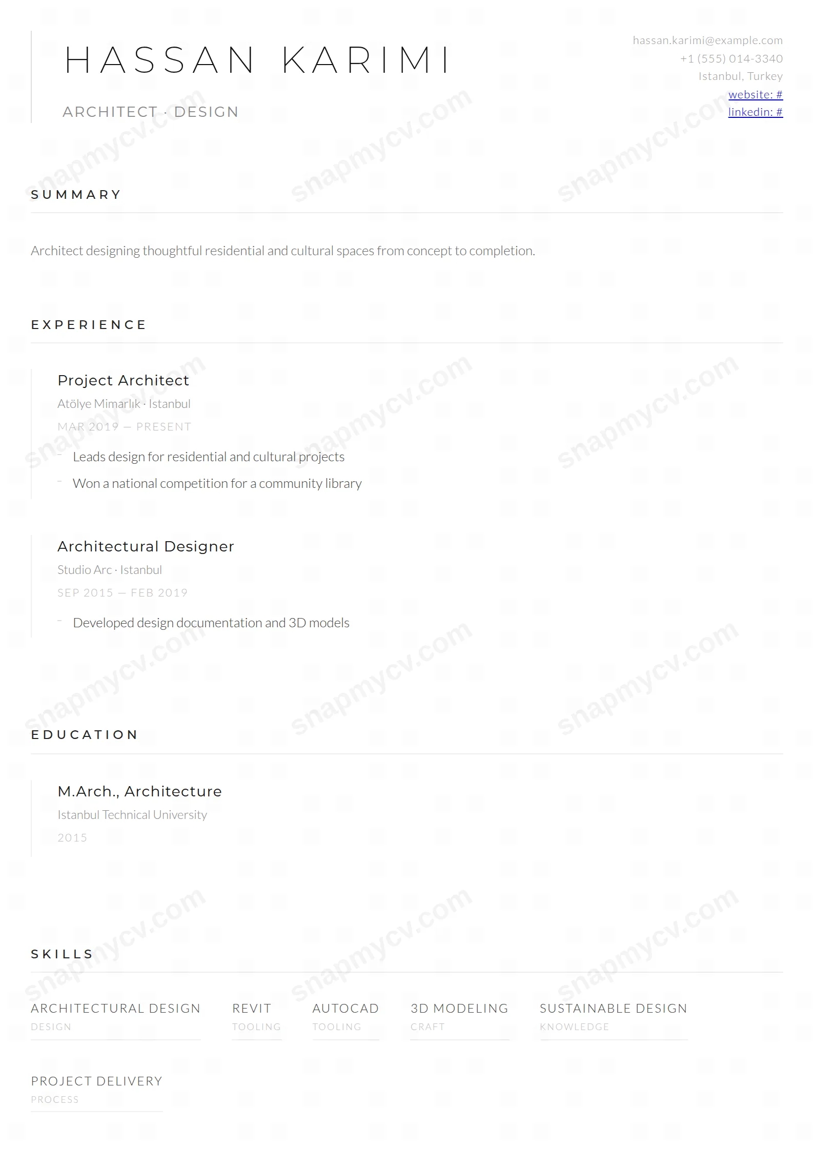
Structured precision with drafting-table discipline: aligned grids, measured whitespace, and project documentation order an architect will recognize instantly.
Best for: architects and built-environment professionals. Free to fill in, restyle, download as a PDF, or publish at your own SnapMyCV link.
Applicant tracking systems: Light styling. Mostly parseable but uses sidebars, columns or visual elements that may confuse stricter ATS.A template's styling never changes the advice that matters most — lead with achievements, quantify your impact, and tailor the content to each role.
New to writing a CV? Read our step-by-step CV guide and ATS tips, then come back and make this design your own.
The Architect treats the page like an elevation drawing rather than a document. It runs in a single column, and the whole composition hangs off one vertical hairline that drops down the left edge of the header. Your name is set in Montserrat at its thinnest weight, uppercase, tracked out to 0.2em so the letters sit apart like a title block. That same 1px margin rule repeats beside every experience and education entry, near-invisible grey at rest and deepening to a darker line on hover, which turns a plain list into a run of measured, ruled-off columns.
There is no accent colour anywhere, and that is the point. The palette is pure greyscale: near-black #111 for headings, soft #444 Lato Light for body copy, and a graded ladder of #888, #999 and #bbb carrying subtitles, dates and contact lines so hierarchy comes from tone alone. Section titles are tracked to 0.3em above thin underlines, dates run as small-caps uppercase, and bullets are reduced to short horizontal dashes. Nothing shouts. Line weight, letter-spacing and generous whitespace do all the ordering, the way a good drawing lets structure speak without decoration.
This is a template for people whose field already prizes restraint and proportion: architects, urban and landscape designers, interior practitioners, and the wider studio world where the portfolio is the real argument and the CV is meant to frame it quietly. The contact block pinned to the top-right corner and the airy margins give a portfolio-led application room to breathe, and the projects section, which sets technologies or collaborators as a subtitle beneath each entry, is the natural place to name signature buildings, competitions or clients.
It is the wrong choice if you need the CV itself to do the persuading. Sales, early-career applicants padding thin experience, or anyone in a loud consumer field who wants a splash of brand colour will find the all-grey palette too austere and unforgiving. With no colour to hide behind, weak or overwritten copy is fully exposed, so this template punishes filler as much as it flatters a well-edited page.
Write to the grid this layout expects. Keep your headline to a single tracked line under your name, then lead each role with a tight one-line description and push the measurable outcomes into the dash-bulleted highlights below it. Use the subtitle slot on experience and project entries deliberately, naming the practice, the collaborators or the key technologies, because that faint grey line is what gives each block its second layer of meaning. Aim for three to five highlights per recent role and taper older entries to a line or two so the ruled columns stay even down the page.
The common mistakes here are all about density. Long paragraph blurbs collapse the whitespace the design depends on, and a twenty-item skills dump breaks the calm of the grid-based skills and languages sections, which read best with a handful of strong, confident entries. Do not try to reintroduce emphasis with capitals or symbols; the tracking and the hairlines already carry the structure, and anything extra fights them. Treat empty space as a material, edit hard, and let the proportions stay clean.
Yes, and it is arguably built for it. Because the design never encodes meaning in colour, only in tone and line weight, a greyscale or mono print loses nothing. The #111 headings, #444 body and lighter grey subtitles keep their contrast steps on paper, so the hierarchy that reads on screen survives a black-and-white printer intact.
It is tuned for a focused one to two page CV, not a dense career dossier. The wide letter-spacing, thin underlines and generous margins mean the page starts to feel airless if you pack in long paragraphs or a dozen roles. Three to five well-edited experience entries with short dash bullets, plus a compact skills and projects section, sits comfortably within its proportions.


