
Premium executive template projecting authority and leadership.
Create a free account to customize and publish this design.
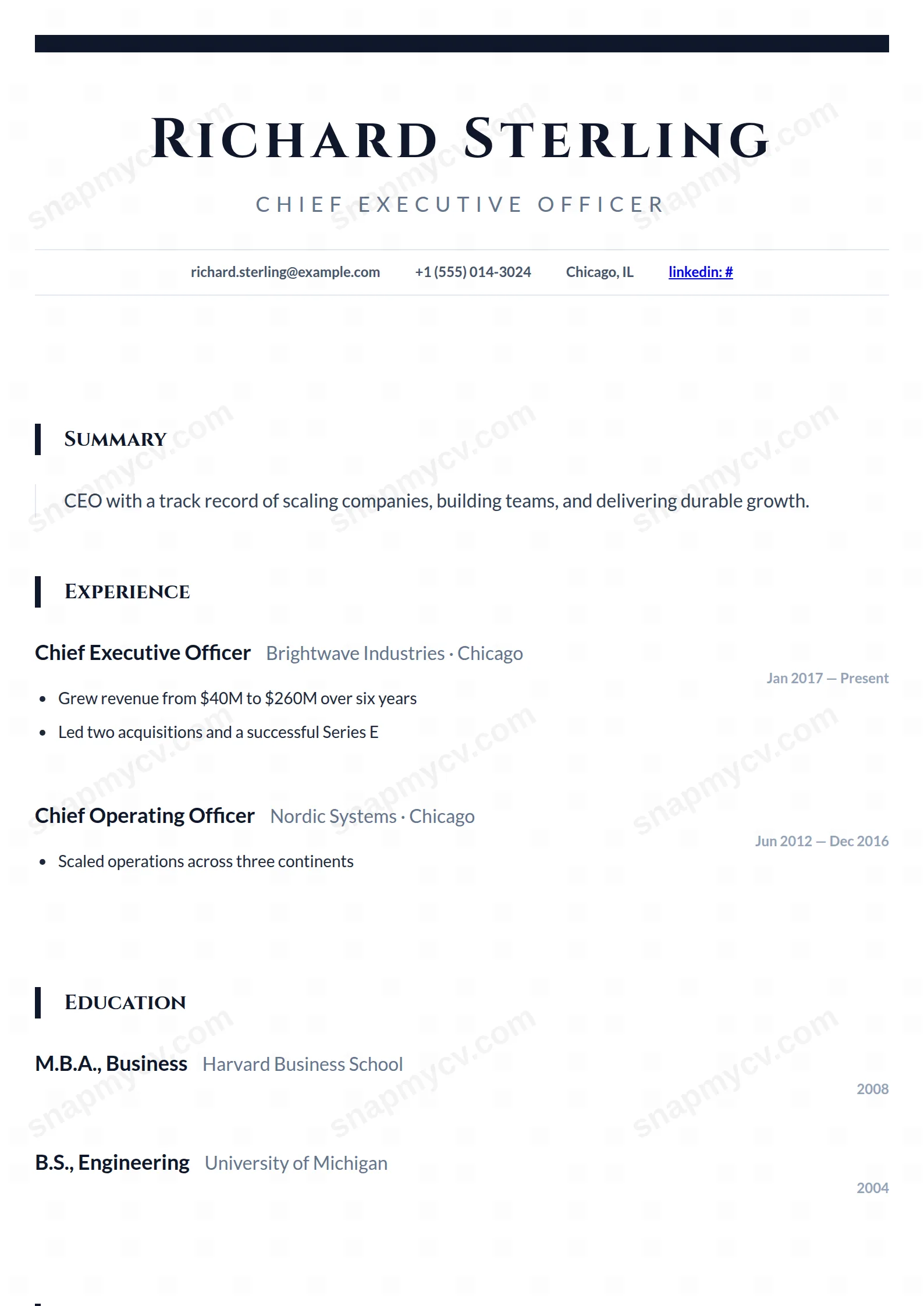
Premium spacing, decisive typography, and an executive-summary opening. Authority is communicated through restraint — nothing on the page asks for permission.
Best for: CEOs, founders, and executive candidates. Free to fill in, restyle, download as a PDF, or publish at your own SnapMyCV link.
Applicant tracking systems: Light styling. Mostly parseable but uses sidebars, columns or visual elements that may confuse stricter ATS.A template's styling never changes the advice that matters most — lead with achievements, quantify your impact, and tailor the content to each role.
New to writing a CV? Read our step-by-step CV guide and ATS tips, then come back and make this design your own.
The CEO is built on a single decisive contrast: Cinzel, an engraved Roman capital serif borrowed from monuments and hardcover jackets, set against the plainness of Lato everywhere else. The name runs centred at 48px with 0.1em tracking, so the letters sit apart like an inscription rather than a heading, and the near-black #0f172a bar across the top frames it the way a masthead frames a title. Fencing the contact row between two hairline rules is the tell that the whole thing is meant to read as printed letterhead, not a typed document.
Restraint is the actual design here. The palette never leaves the slate family, anchoring on #0f172a and softening to muted grey #64748b for the spaced uppercase headline and the right-aligned dates, so nothing competes with the serif. Section titles come back in Cinzel, each pinned by a five-pixel slate bar on the left, and the summary is offset by a thin vertical rule and a roomy 1.8 line height. Authority is manufactured entirely through whitespace, tracking and that one display face, which is why the page feels expensive without a single accent colour.
This is a template for people at the top of the masthead: chief executives, founders, managing directors, non-executive directors and board members who need presence without decoration. The ceremonial centred header and calm single column suit an executive search dossier, a board pack or an NED profile, and the generous column gives two or three decades of career room to breathe across A4.
Be honest about the fit. The ceremonial styling can read as pretension on a junior or mid-level CV, where a plainer template signals more competence. Cinzel is a capitals-first display face, so it looks laboured on long lists and detailed technical content, which makes this a poor choice for engineers, designers or academics who need to show dense skills, publications or portfolios. If your value is in volume of detail rather than seniority and outcomes, a two-column or sidebar layout will serve you better.
Because the layout is one uninterrupted column, sequence carries the story: summary first, then experience in reverse-chronological order with dates floating right in small bold grey, then the skills grid near the foot. Lead the summary with scale, P&L and board-level outcomes rather than duties, and keep it to three or four lines so the vertical rule beside it stays elegant. Hold experience to a handful of quantified results per role; the wide 1.8 line height means padded bullets bloat the page fast and drain the whitespace that does the persuading.
Respect the structural quirks. Section names feed straight into Cinzel, which rewards short confident labels like Experience or Leadership and punishes long uppercase phrases that wrap awkwardly. The three-column skills grid, with each entry underlined, is built for tight board-level competencies, not sprawling tool inventories, so a dozen sharp terms beats forty. The most common mistake is treating the empty space as room to fill; on this template, negative space is the design, and crowding it dismantles the letterhead effect the whole layout is engineered to create.
Yes, better than most. The palette is already an all-slate scheme running from near-black #0f172a to muted grey #64748b, with no accent colour to collapse, so a greyscale print or a monochrome office laser loses almost nothing. The hairline rules, the five-pixel section bars and the Cinzel headings all depend on tone and spacing rather than hue, which is exactly what survives black-and-white reproduction.
It is tuned for a long, senior history rather than a packed one. The centred Cinzel header, wide tracking and 1.8 line height eat vertical space deliberately, so the column reads best with four to six roles carrying a few quantified bullets each, plus a tight skills grid. If you try to force ten roles or long duty lists into it, the whitespace that creates the gravitas disappears and the letterhead effect breaks down.


