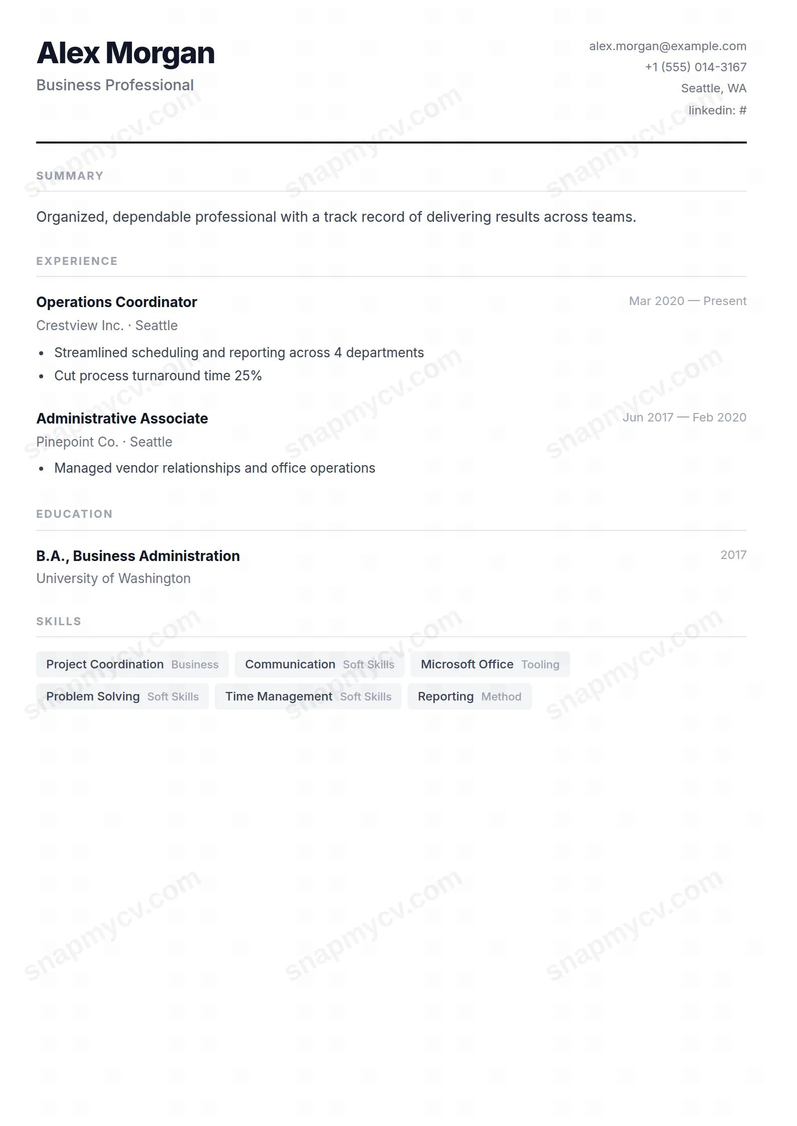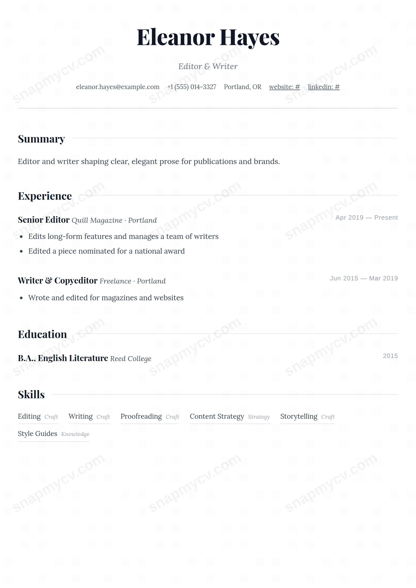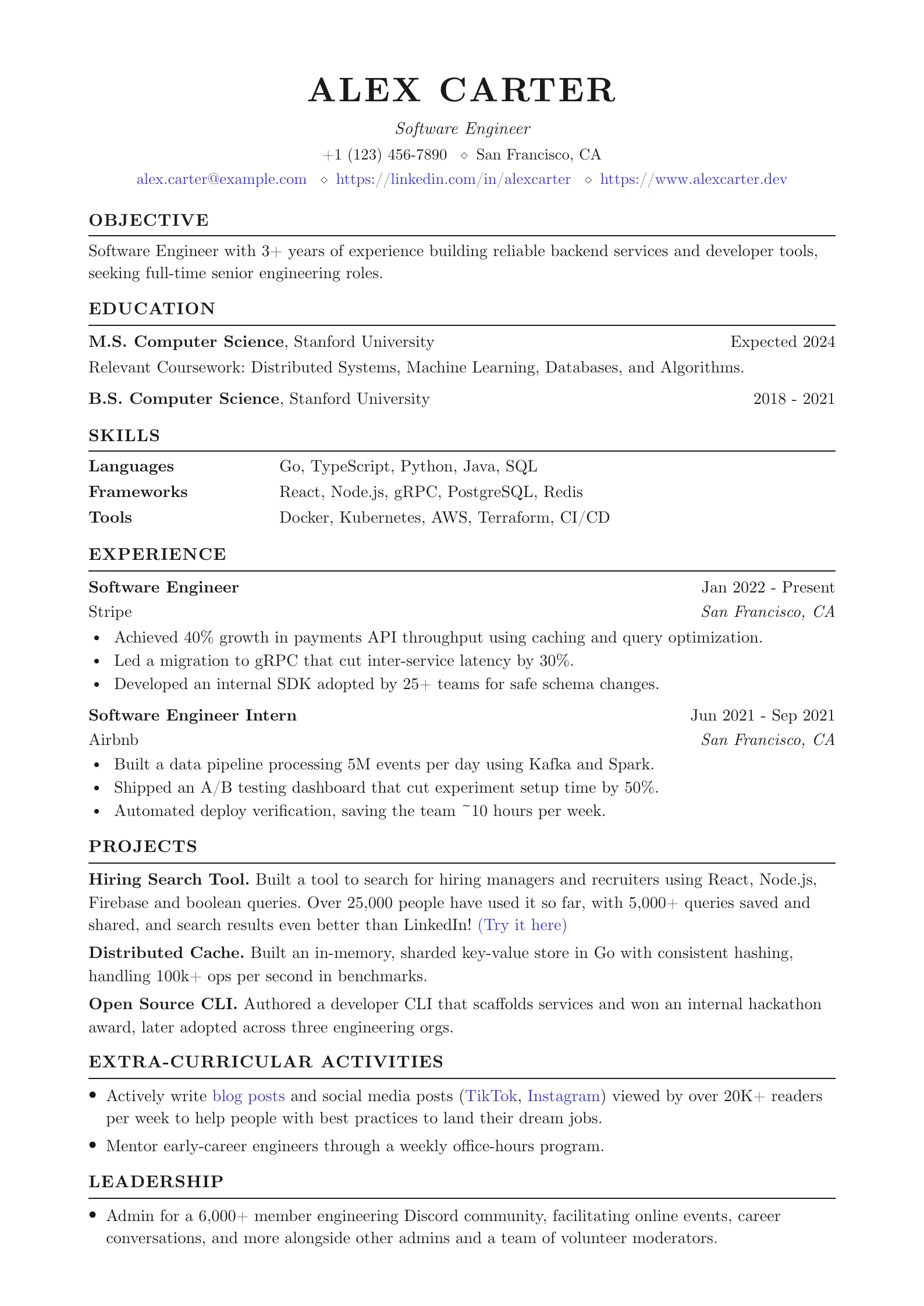
Portfolio-style template tailored for UX/UI and graphic designers.
Create a free account to customize and publish this design.
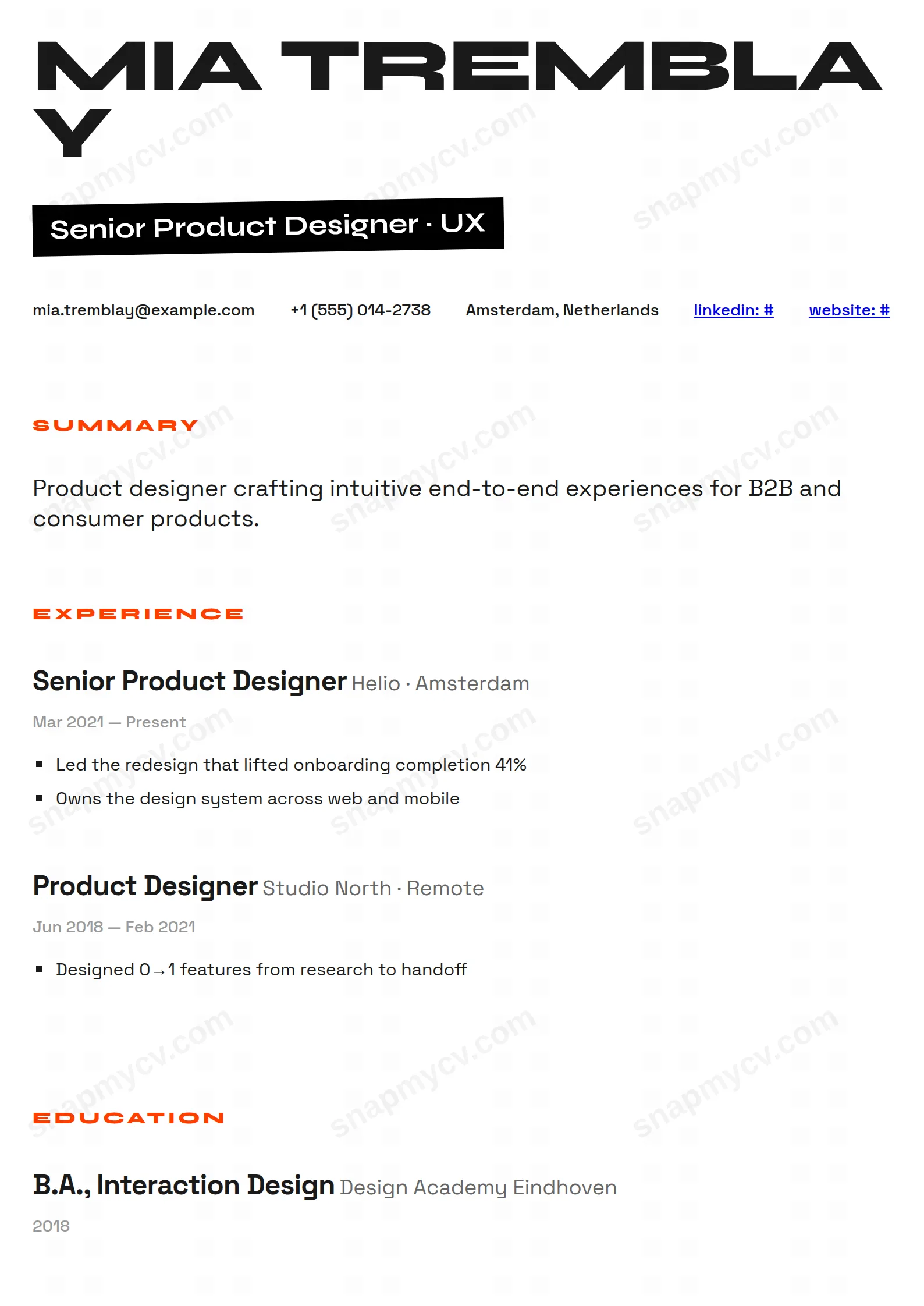
Portfolio-style structure with visual breathing room and typographic care — evidence of design judgment before a single case study is opened.
Best for: UX/UI and graphic designers. Free to fill in, restyle, download as a PDF, or publish at your own SnapMyCV link.
Applicant tracking systems: Light styling. Mostly parseable but uses sidebars, columns or visual elements that may confuse stricter ATS.A template's styling never changes the advice that matters most — lead with achievements, quantify your impact, and tailor the content to each role.
New to writing a CV? Read our step-by-step CV guide and ATS tips, then come back and make this design your own.
The Designer is built on a single deliberate bet: your name is the hero of the page, not a header you skim past. It lands at 120px in Syne Extrabold, uppercase and tightly tracked, so the top of the CV reads like a gallery wall label rather than a form field. Everything below it is arranged on one 900px column of Space Grotesk body copy, which keeps the eye travelling straight down and gives each block room to breathe instead of competing across gutters.
The palette is disciplined on purpose: high-contrast monochrome with exactly one accent, a hot Designer Orange (#ff3e00) that recurs in the small spaced-out section titles, the skill categories, language levels, and the slash before every hobby tag. The signature move is the headline badge, your title reversed white-on-black and rotated a single degree, a controlled imperfection that signals a layout artist made a choice. Skills are underlined with a heavy 4px black rule rather than sat in pills, and experience entries are separated by generous 40 to 60px gaps, so restraint, not decoration, does the work.
This is a portfolio-adjacent CV for people whose taste is part of the hire: graphic designers, art directors, brand and product designers, illustrators, and creative leads pitching studios or in-house teams that judge on sight. It carries summary, experience, education, skills, projects, certifications, languages, awards, publications, volunteering, hobbies, and custom sections, so a multidisciplinary maker can show range without the single column ever feeling crowded.
Be honest about where it works against you. If you are applying into law, finance, medicine, academia, or government, the 120px name, reversed rotated badge, and orange accents will read as loud rather than credible, and a more sober layout serves you better. It also rewards people who actually have visual work to point to. If your contact row has no folio link and your experience is text-heavy with no outcomes to headline, the poster-like framing over-promises what the content delivers.
Feed the layout the way it wants to be read. Keep your title short so the rotated badge stays on one tidy line, and write the summary as one sharp sentence, because at 20px it is the first thing a reviewer reads after your name and a rambling paragraph breaks the composition. Use the orange category tag for your discipline and the 4px underlines for tools and software, and let the square-bullet highlights carry measurable outcomes rather than duties. Put your portfolio URL in the contact row so the CV becomes a cover for the work, not a substitute for it.
The common mistakes are all about overloading a design that thrives on space. Do not stuff every one of the twelve possible sections in, pick the four or five that prove range and let the 40 to 60px gaps do their job. Keep experience to three or four roles with two or three highlights each, and avoid long walls of prose that flatten the type hierarchy. The template is at its best when each block is short and confident, so the monochrome layout and single orange accent stay legible instead of turning busy.
The underlying structure is a single-column flow with conventional section headings, which most parsers read in the correct order. The oversized Syne display type, the white-on-black rotated title badge, and the orange accents are pure styling, so a strict tracker may drop the badge or ignore the colour. Before applying through a portal, export the PDF, paste it into a plain-text editor, and confirm the headings and sequence still read cleanly.
Yes, because the design never relies on colour to carry meaning. The layout is fundamentally high-contrast monochrome, and the Designer Orange (#ff3e00) only tints section titles, skill categories, and hobby slashes that are already distinguished by size, spacing, and the heavy 4px underlines. In greyscale the orange simply reads as a medium-grey emphasis, so the hierarchy and the reversed headline badge hold up on a black-and-white printout.