
Technical and clean layout optimized for software developers.
Create a free account to customize and publish this design.
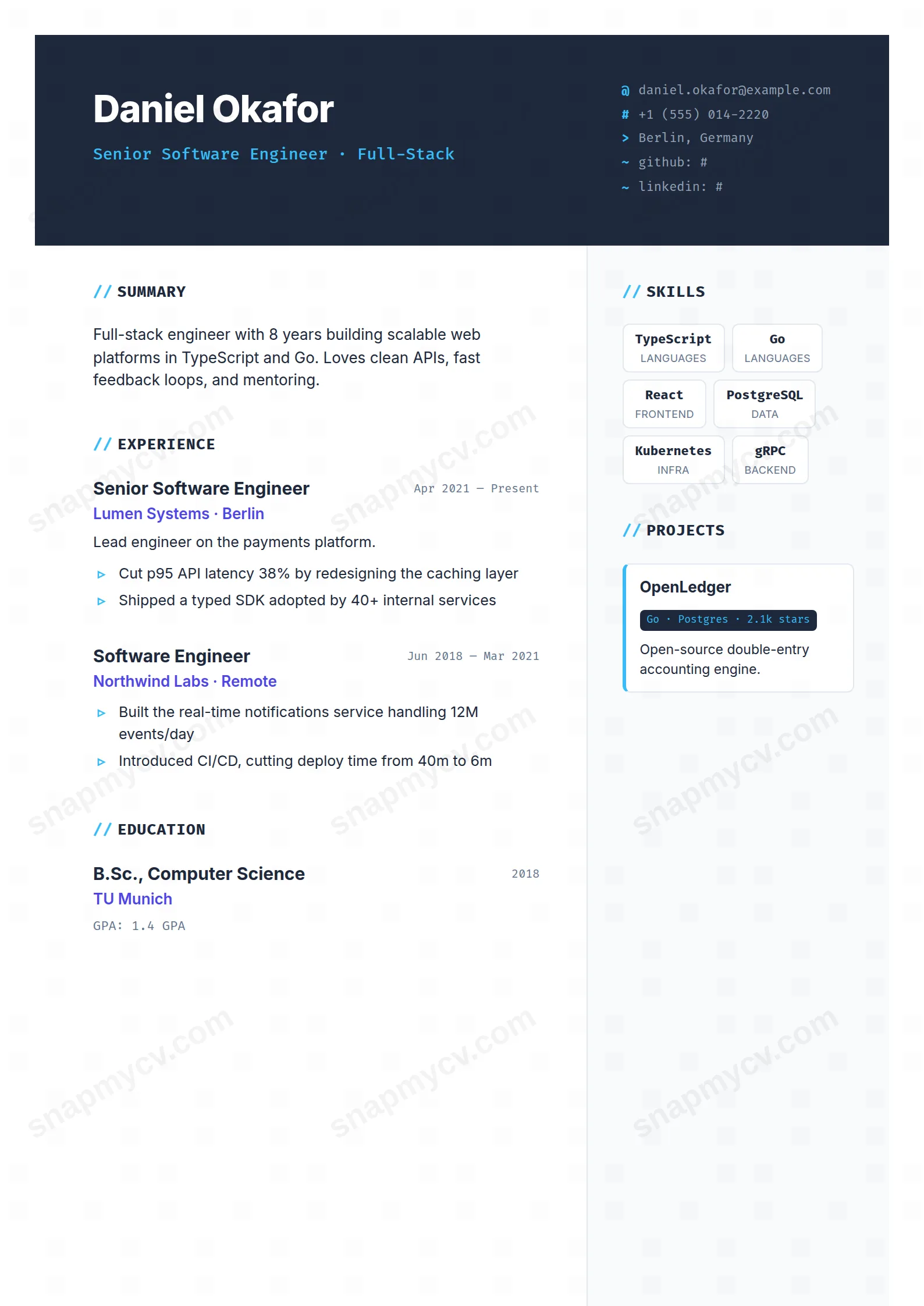
A technical layout that gets out of the way: clean stack lists, project links, and a hierarchy optimized for the thirty-second engineering screen.
Best for: software developers and engineers. Free to fill in, restyle, download as a PDF, or publish at your own SnapMyCV link.
Applicant tracking systems: ATS-friendly. Single-column, standard section headers, parses cleanly in most applicant tracking systems.A template's styling never changes the advice that matters most — lead with achievements, quantify your impact, and tailor the content to each role.
New to writing a CV? Read our step-by-step CV guide and ATS tips, then come back and make this design your own.
The Developer builds its whole identity around one deliberate reference: the code editor. The canvas is a deep slate (#0f172a), and the accent work is split between cyan and indigo so that headings, links and skill markers read the way syntax highlighting does inside an IDE. That is not decoration for its own sake. On most CVs a dark background is a gamble, but here the audience is the exact group that lives in dark themes all day, so the palette signals belonging before a single bullet is read.
Underneath the styling the layout stays deliberately plain so the colour can do the talking. A clear header anchors your name and links, a dedicated skills block surfaces your stack at a glance, and the experience entries are given room to carry the specifics engineers actually scan for: what you built, the technologies behind it, and the result. The cyan and indigo are used sparingly against all that dark space, which keeps the hierarchy legible instead of turning the page into a neon wall.
Reach for The Developer if you write code for a living or adjacent to it: software engineers, data and ML practitioners, platform and infrastructure people, or anyone applying into an engineering org that will read the dark IDE palette as fluency rather than gimmick. It rewards a header that carries a GitHub or portfolio link, and it flatters a CV where the strongest evidence is the stack and the shipped work.
Be honest with yourself about the fit if you are aiming at conservative, non-technical audiences. A law firm, a bank's front office, or a formal academic panel may read the cyan-on-slate treatment as informal. It also uses a lot of ink, so if your CV will be printed in volume rather than screened as a PDF, the heaviness works against you. Anyone who wants a neutral, ink-light document should choose a light template instead.
Treat the header as prime real estate: name, target role, and one or two live links (GitHub, portfolio, or a key project). Those links sit in the accent colour, so they draw the eye first, which is exactly where a technical reviewer wants to click. Keep the skills block tight and honest. It is designed to surface your stack at a glance, so list the languages, frameworks and tools you would defend in an interview rather than padding it with everything you have touched once. A dozen focused entries reads better against the dark background than forty greyed-out ones.
In the experience entries, lead every bullet with an outcome and then attach the technology, because that is the order this layout is built to reward: 'cut p95 latency 40 percent with a Redis read-through cache' beats 'worked on performance'. The common mistake with a striking dark template is leaning on the look and letting the prose go vague, which wastes the credibility the palette buys you. Aim for three to five bullets per role and keep the summary to two or three lines, so the disciplined structure stays airy and the cyan and indigo accents never have to compete with a wall of text.
No. Applicant tracking systems parse the underlying text, not the colours, so the #0f172a background and cyan accents are invisible to them. What matters is that this template uses standard section headings and selectable text, both of which it does, so your content is read cleanly regardless of the dark styling.
The cyan and indigo accents flatten into mid-greys against the dark slate, so the syntax-highlighting effect that makes it distinctive on screen mostly disappears on paper. The dark background also consumes a lot of ink and can look heavy. This is a design that is at its best as a screen-viewed PDF or a shared link, so preview the print output before sending it anywhere that prints in volume.


