
Modern and vibrant template for content creators and influencers.
Create a free account to customize and publish this design.
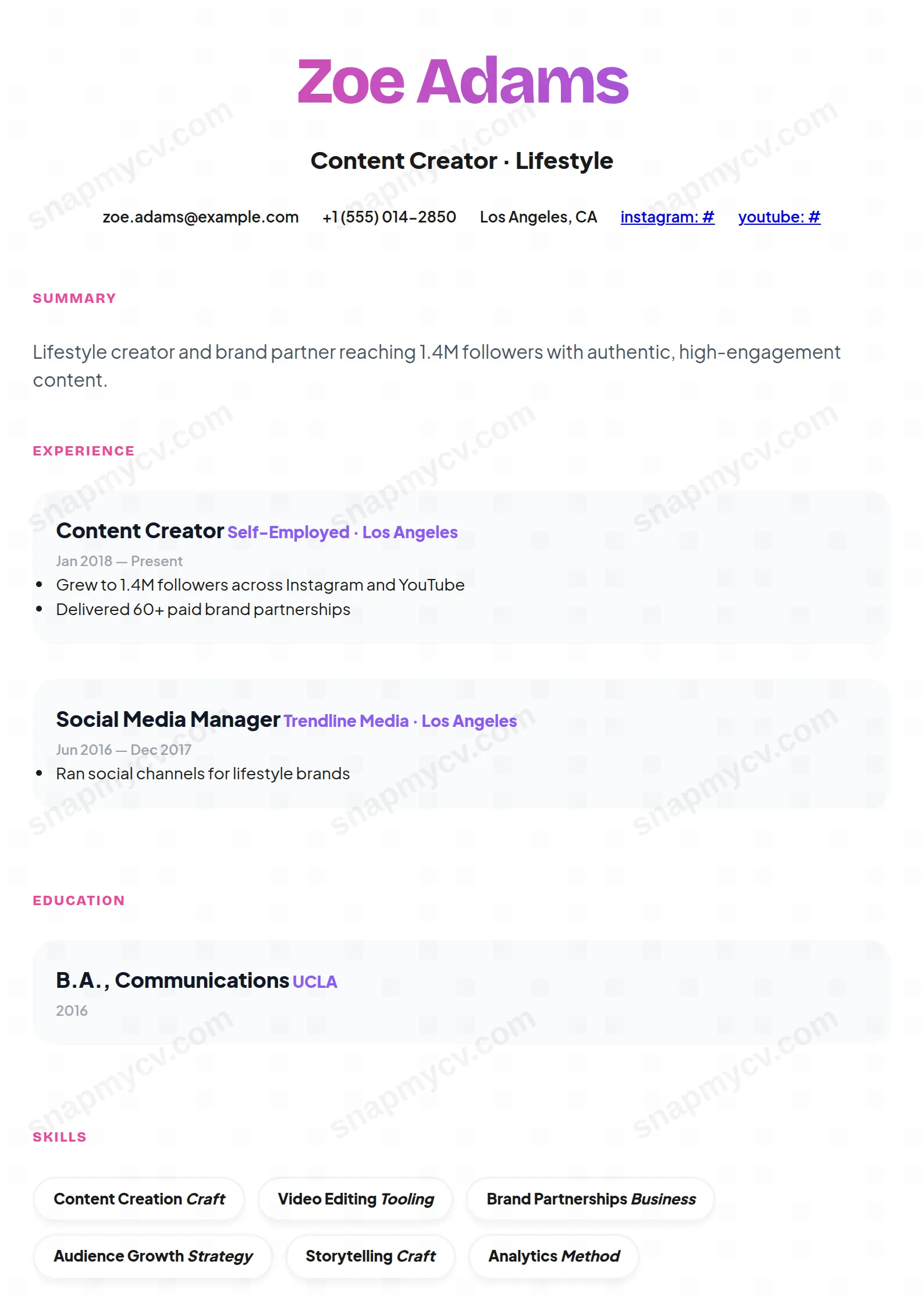
Modern, vibrant, and audience-aware, with space for follower metrics, brand collaborations, and platform range. A media kit and CV in one page.
Best for: content creators and influencer-marketing talent. Free to fill in, restyle, download as a PDF, or publish at your own SnapMyCV link.
Applicant tracking systems: Light styling. Mostly parseable but uses sidebars, columns or visual elements that may confuse stricter ATS.A template's styling never changes the advice that matters most — lead with achievements, quantify your impact, and tailor the content to each role.
New to writing a CV? Read our step-by-step CV guide and ATS tips, then come back and make this design your own.
The Influencer front-loads its personality. Your name is set in Bricolage Grotesque at 56px with a pink-to-violet gradient (#ec4899 to #8b5cf6) bled into the letterforms, centred over a bold headline and a single row of contact details. Bricolage Grotesque is a display grotesque with slightly quirky proportions, so it carries a gradient far better than a neutral sans would; the letters have enough weight and width to hold colour without turning muddy. That splash sits inside a white card with 32px rounded corners and a soft drop shadow, floating on a pale pink page (#fdf2f8). The deep radius and the shadow are what make it read as a profile card rather than a paper form.
Below the header the design deliberately calms down. It runs a single column, sets body copy in Plus Jakarta Sans in near-black, and reduces section titles to tiny uppercase pink labels, so hierarchy comes from scale and colour rather than rules or boxes. Each role or project lives in its own pale grey rounded tile with company and tech names picked out in violet, and skills become white pill badges with bordered edges. The restraint underneath is the whole trick: one loud gradient moment up top buys the rest of the page permission to stay quiet and legible.
This template is built for people whose work is half portfolio and half personality: content creators, social media managers, community and brand builders, influencer-marketing specialists and creative freelancers. The gradient name and profile-card framing signal a person who is comfortable being visible, and the header row expects a website and social handles as first-class contact details, not afterthoughts. If your field rewards audience, voice and reach, this design reads as fluent rather than flashy.
Be honest about where it misfires. Law, banking, government, academia and most corporate graduate schemes still expect ink-on-paper sobriety, and a pink page with a violet-gradient name will feel off-register there. It also leans junior-to-mid creative; a C-suite operator or a research scientist will look under-serious inside a rounded pink card. And because the gradient is the signature, anyone who wants to strip colour out to look neutral is fighting the template instead of using it.
Treat the headline slot under your name as prime real estate and give it a sharp positioning line, not a job title: what you make, for whom, and the scale of your audience. Because every role sits in its own grey tile, open each one with an outcome a brand actually pays for (reach, engagement rate, conversions, partnership value, follower growth) and keep the tile to three or four tight lines so it does not balloon past its rounded frame. Lean on the violet company and tech accents by naming real platforms and collaborators, since those coloured tokens are what a skim-reader catches first.
The most common mistakes are overstuffing the pill grid and drowning the summary. Skill badges are white bordered pills, so they only look clean as short single phrases; long strings wrap and break the neat row, so aim for roughly six to ten crisp tags. The larger grey summary text is where your voice should live, so keep it to two or three sentences rather than a paragraph wall. Fill four to six roles at most; the single-column, tile-per-role rhythm stays elegant on one or two pages and starts to feel repetitive if you push much beyond that.
The gradient is applied to live text, not an image, so a name in Bricolage Grotesque still parses as selectable characters, and the single-column layout with conventional section labels reads in a sensible order. The risk is not the colour but the overall creative styling, so run the plain-text test before applying: copy everything out and confirm your name, roles, dates and skills come through cleanly. For a strictly ATS-gated role, keep a plainer version alongside this one.
It loses its two loudest signals. The pink-to-violet name gradient flattens to a mid-grey and the tiny pink section labels drop to near the same tone as the body, so the header stops shouting. Structure survives well because the pale grey role tiles, the bordered white skill pills and the 32px rounded card all read through contrast alone, but greyscale strips out most of the personality that makes this design worth choosing, so print it in colour whenever you can.


