
Two-column A4 portfolio with timeline experience, pill skills and a bordered project grid — built for engineers with deep breadth.
Create a free account to customize and publish this design.
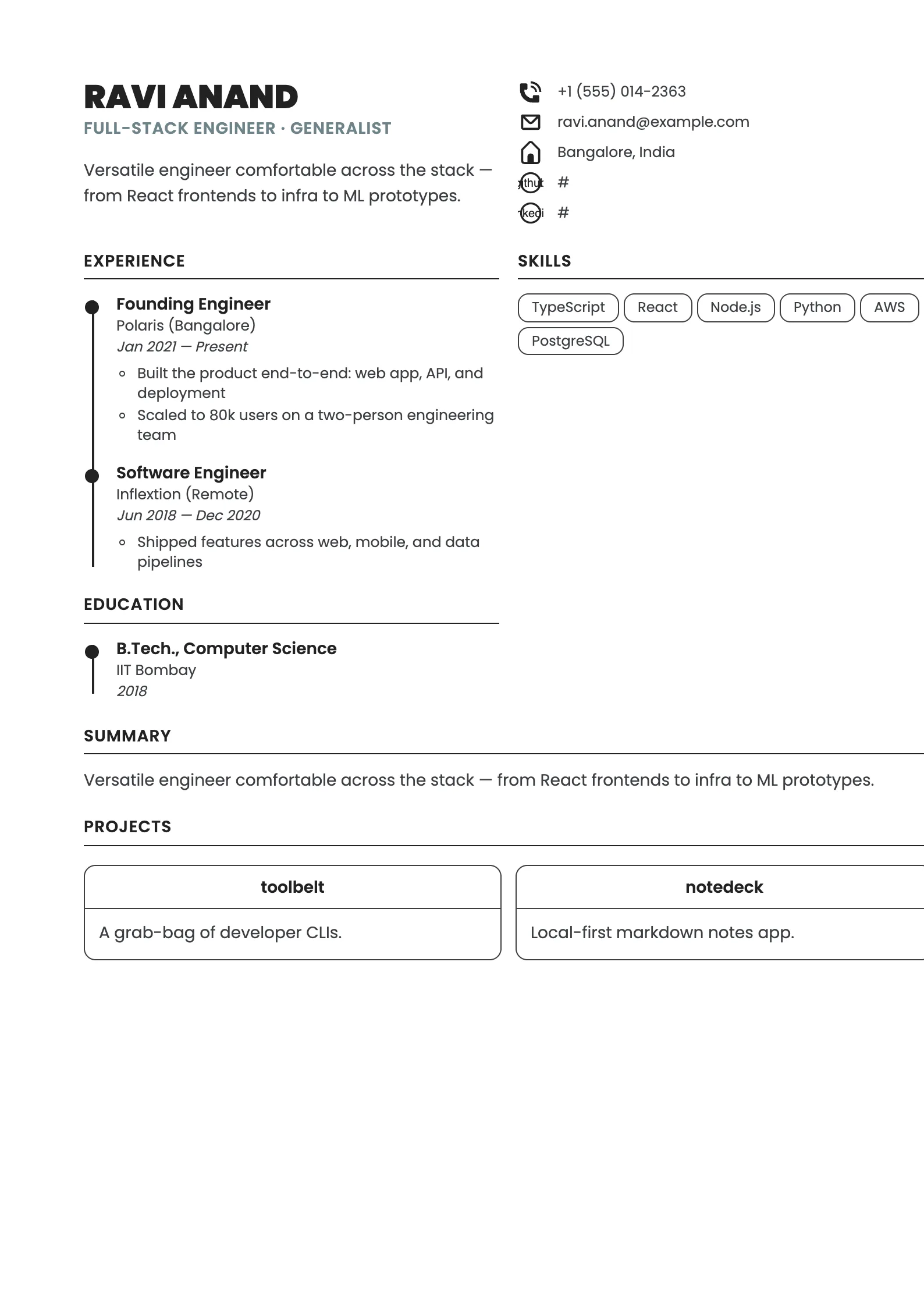
A two-column A4 layout that lets a many-sided career read as one coherent story: a timeline spine for experience, pill-shaped skill tags, and room for side projects without crowding the page. If your work spans disciplines, this keeps the breadth scannable instead of scattered.
Best for: generalists, consultants, and multi-disciplinary careers. Free to fill in, restyle, download as a PDF, or publish at your own SnapMyCV link.
Applicant tracking systems: Light styling. Mostly parseable but uses sidebars, columns or visual elements that may confuse stricter ATS.A template's styling never changes the advice that matters most — lead with achievements, quantify your impact, and tailor the content to each role.
New to writing a CV? Read our step-by-step CV guide and ATS tips, then come back and make this design your own.
The Polymath commits to a single geometric typeface, Poppins, from the 900-weight uppercase name block down to the smallest contact row. Setting one family across the whole A4 column keeps a page that carries a lot of variety, formal roles, side projects, publications, feeling like one considered document rather than a patchwork. The colour discipline is severe on purpose: near-black ink at #222 for names and headings, a softer #3D3F43 for body copy so paragraphs sit back from the titles, and a single muted slate-teal at #6D8389 held in reserve for the job title alone. Nothing else competes for the accent, so the eye lands where you want it.
The layout earns its name through structure. Below the header the page divides into a wider left rail that renders experience, education, certifications, volunteering, awards and publications as vertical timelines, each role pinned by a filled dot on a thin connecting rule, and a narrower right rail that holds skills, languages and hobbies as outlined rounded pills. Projects then break the grid and run full-width as bordered cards with centred titles and a dashed technology strip. That mix of a formal spine and a modular card system is a deliberate answer to a specific problem: showing breadth without the CV reading as scattered.
This is a template for people whose value is range. Designer-developers, founders who still ship, researchers with a build habit, consultants and creative technologists all benefit from a layout that gives a projects grid equal billing with a conventional career timeline. If you have side work, open-source, or a portfolio that matters as much as your titles, the full-width project cards let it stand on its own instead of hiding in a bullet list.
Be honest about when it fights you. If you are a deep specialist with one linear career and no projects to show, the right-rail pills and the empty project cards will look under-fed, and a plain single-column CV will serve you better. Conservative fields such as law, banking or government still expect a restrained one-column document, and the two-column body plus card grid can read as too design-forward there. The Polymath rewards a full, varied history and punishes a thin one.
Feed each region the shape of content it was built for. In the left timeline, lead every role with measurable wins and keep entries to a few tight lines so the dots stay evenly spaced down the rule; long unbroken paragraphs blur the vertical rhythm that makes the spine legible. In the right rail, let skills and languages live as single words or short phrases so each pill stays compact, and resist dumping thirty skills, a dozen well-chosen pills read as confidence while an overflowing rail reads as noise. The header contact stack pairs each line with an icon, so keep those values short and real.
The project cards are where most people go wrong. Hold each description to a sentence or two so the bordered cards stay a consistent height, and tag three or four technologies in the dashed strip rather than a sprawling stack. Three to five strong projects suit the grid; ten weak ones do not. Across the whole document, aim to fill the page without crowding it, one well-populated A4 column, and remember the accent is intentionally quiet, so your range, not the colour, has to carry the impression.
The section names are standard (Experience, Education, Skills, Projects) and the underlying text is clean, which most parsers handle. But the two-column body, the icon-led contact rows and the full-width project cards can be read out of order by stricter systems. After exporting, paste the PDF into a plain-text editor and confirm every date and detail survives in a sensible sequence before you submit.
Yes. The accent at #6D8389 is used only on the job title and is muted to begin with, so in black-and-white it simply drops to a mid grey without breaking the hierarchy. The real contrast comes from the 900-weight Poppins name, the #222 headings and the timeline dots, all of which are tonal rather than colour-dependent, so a greyscale print reads almost exactly as the colour version does.


