
Data-driven and analytical template for business strategists.
Create a free account to customize and publish this design.
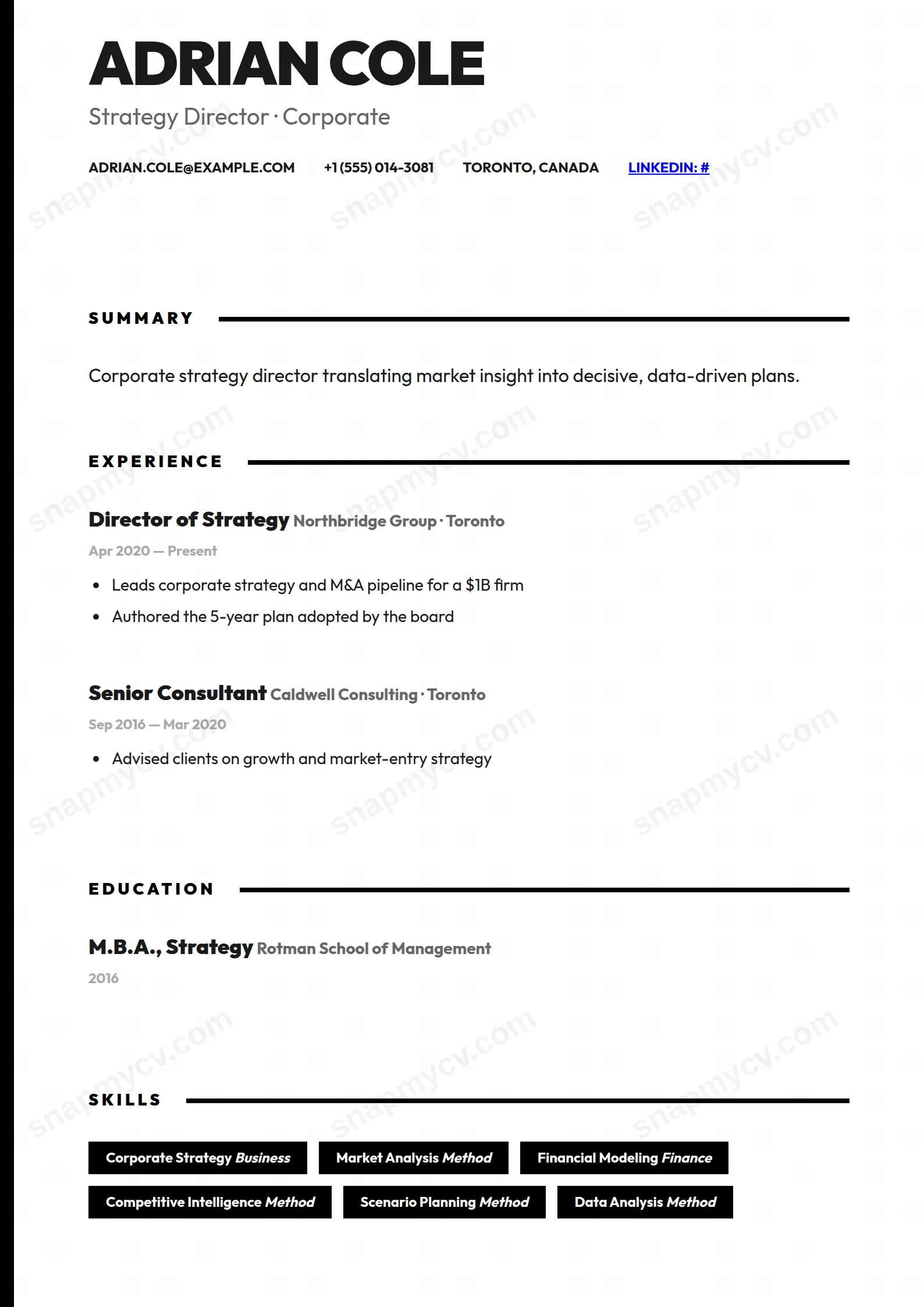
Analytical structure with data-forward sections: frameworks, market outcomes, and decisions defended by numbers. Reads like someone who brings the pre-read.
Best for: strategists and business analysts. Free to fill in, restyle, download as a PDF, or publish at your own SnapMyCV link.
Applicant tracking systems: ATS-friendly. Single-column, standard section headers, parses cleanly in most applicant tracking systems.A template's styling never changes the advice that matters most — lead with achievements, quantify your impact, and tailor the content to each role.
New to writing a CV? Read our step-by-step CV guide and ATS tips, then come back and make this design your own.
The Strategist commits to one idea and executes it without compromise. A thick 12px black bar runs down the left edge of the page, the only structural flourish in the entire layout, and it works like the spine of a slide deck, giving a single column of pure black ink on white something to lean against. The name opens at 52px, uppercase, cut in the heaviest 900 weight of Outfit, so the reader meets conviction before they meet a single word of prose. There is no colour to hide behind and no sidebar to park secondary detail. Everything competes for the same vertical channel, which forces discipline on the writer.
Hierarchy here is engineered entirely from contrast and weight rather than hue. Section titles sit small, widely letter-spaced and quiet, each one trailing a solid black rule that cuts across the page to mark a new movement. Roles arrive in bold 18px and hold the eye, while companies and dates step down into greys so they read as supporting metadata rather than headlines. Skills land as solid black badges with white text, the one place the ink inverts, which turns a capability list into a row of firm, deliberate stamps. It is a design that trusts typography to do the persuading.
This template is genuinely right for people whose job is framing problems and driving decisions: management and strategy consultants, corporate and business strategists, product and operations leads, chiefs of staff, and anyone who opens a conversation with a point of view and then defends it with outcomes. The monochrome severity signals rigour, and the generous header plus summary block reward a candidate who leads with a sharp positioning line. If your value is judgement, scope and results, the austerity flatters you.
It is the wrong choice for anyone whose craft is visual. Designers, illustrators, brand and creative roles, and photographers will find the all-black, zero-imagery treatment actively works against them, since there is nowhere to show range or colour sensibility. It also punishes thin experience: with no second column and no decorative padding, a light CV looks stark rather than confident. If you need warmth, or you are early enough in your career that the page would read half-empty, a softer two-column layout serves you better.
Treat the top of the page as a thesis statement. The 52px name and the summary block carry disproportionate weight, so spend real effort on a two or three line positioning summary that says what you do and at what altitude, then let the experience section prove it. Because every item shares one column, keep experience entries to three to five highlight bullets each, and load those bullets with quantified results, remit and scope rather than duties. The widely letter-spaced section titles and their black rules give you clean breaks, so lean on the supported projects, certifications, languages and awards sections to shape a narrative instead of padding any single block.
The common mistake with this style is treating the black skill badges as a dumping ground. A long run of badges collapses the deliberate, stamped effect into noise, so keep them to a tight set of frameworks and methods that genuinely define you, ten to fourteen at most. Watch your total length too: the spare styling means an overlong CV reads as undisciplined rather than thorough, so aim for one page early-career and two at most for senior profiles. Let the greys carry companies and dates, let bold roles carry the eye, and resist the urge to add emphasis the design has deliberately withheld.
No, the underlying structure is ATS-safe. It is a true single column with conventional headings like Experience, Education and Skills and a straight top-to-bottom reading order, which parsers follow reliably. The left bar is decorative and carries no text, and the black badges hold real, selectable words, so a plain-text copy of the rendered PDF should read every skill and date back in order.
It holds up better than almost any coloured layout, because it is already monochrome by design. There is no hue that could flatten into an ambiguous grey, so the black spine, the section rules and the inverted white-on-black skill badges all keep their intended contrast on a laser printer or a photocopy. The only tones that shift are the deliberate greys on companies and dates, and those are meant to recede, so nothing important is lost.


