
Safety-yellow badges and bold type for skilled trade professionals.
Create a free account to customize and publish this design.
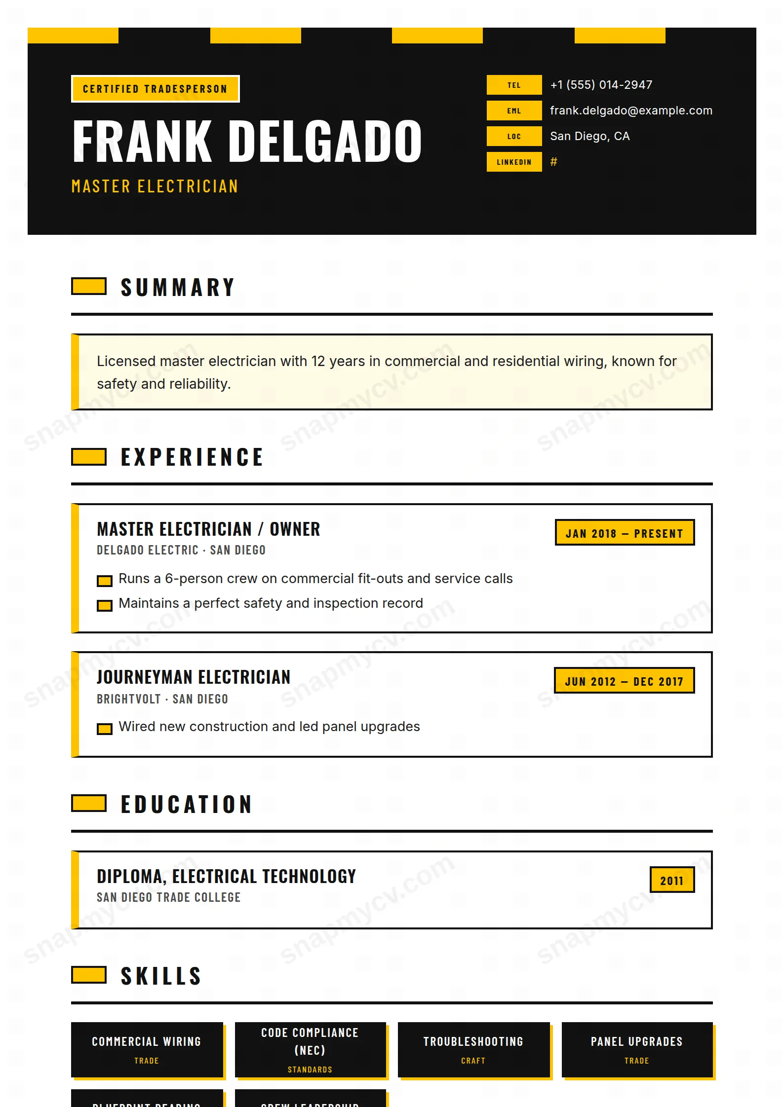
Safety-yellow badges, bold type, and zero fuss. Certifications and tickets sit up front where site managers look first, and the layout stays legible printed in a portacabin.
Best for: skilled trades, site supervisors, and technicians. Free to fill in, restyle, download as a PDF, or publish at your own SnapMyCV link.
Applicant tracking systems: ATS-friendly. Single-column, standard section headers, parses cleanly in most applicant tracking systems.A template's styling never changes the advice that matters most — lead with achievements, quantify your impact, and tailor the content to each role.
New to writing a CV? Read our step-by-step CV guide and ATS tips, then come back and make this design your own.
The whole design runs on one decision: treat the page like signage on a live site. The header is a solid black block capped by a hazard stripe of alternating yellow and black chunks, and your name is set enormous in condensed uppercase Oswald so it reads at a glance the way a warning placard does. Your trade sits under it in safety-yellow (#FFC400), a bordered CERTIFIED TRADESPERSON tag anchors the left, and contact details line up on the right as stamped chips labelled TEL, EML and LOC. Nothing here is decorative for its own sake. High contrast, heavy weight and a single accent colour are exactly the visual grammar of workwear, tool livery and safety notices, so the CV signals its trade before a word is read.
That badge language carries the length of the single column rather than fading after the header. Experience entries are cards with a thick yellow left edge and a hard black outline, dates sit in a yellow tab, and bullets are tiny yellow rectangles instead of soft dots. Skills print as black badges with a blunt yellow drop-shadow, certifications get rivet-style ring marks in a two-up grid, and languages sit in yellow-capped boxes. Barlow Condensed handles the labels so the small type stays tight and mechanical next to Oswald's bulk. The result is loud and deliberately unsubtle, built to look competent and hands-on rather than corporate.
Trade Pro is built for skilled trades where tickets and licences carry as much weight as job history: electricians, plumbers, welders, HVAC and gas engineers, carpenters, mechanics, plant operators and site supervisors. The dedicated certification grid is the tell. If you hold an electrical licence, gas registration, forklift ticket or first-aid card, this layout treats those as headline credentials rather than footnotes, which is exactly how a foreman or hiring agency reads them. It also suits people applying direct to contractors and trade firms, where a bold, unmistakably practical CV lands better than a muted office template.
Be honest about where it does not belong. The safety-yellow and black scheme is far too loud for corporate, legal, finance, academic or conservative white-collar roles, and it will read as costume in a creative studio that expects restraint. If your value is long written narrative, research or client-facing polish, the short-line card format and heavy signage styling will fight you. Anyone who needs a quiet, neutral one-pager should pick something plainer. This template earns its keep specifically when looking capable with your hands is the point.
Feed each structural feature the content it was shaped for. The summary box at the top wants two or three sentences: your trade, years on the tools and your key tickets, nothing more. Experience cards reward short punchy lines because the yellow rectangle bullets and bordered edges look cramped under long paragraphs, so write outcomes a site cares about, jobs completed, safety records, equipment operated, crews run, and cap each role at three or four bullets. Put every licence and card into the certification grid with issuer and dates so the rivet marks pair with real credentials rather than sitting half empty, and aim for an even number of entries so the two-up grid stays balanced.
The common mistakes are all about volume and phrasing. Skill badges break their clean shape when you stuff a full sentence into one, so use recognisable terms like Three-Phase, MIG Welding or Confined Space rather than descriptions. Do not let the summary sprawl or the header chips overflow, since TEL, EML and LOC are sized for compact values. Keep the whole thing to one page: the condensed Oswald and Barlow type already pack a lot in, and the design reads as confident only while there is black and yellow breathing room between the cards. Overload it and the signage effect collapses into noise.
The underlying structure is single-column with conventional headings, which parses cleanly, but the yellow tabs, badges and rivet marks are visual layers an ATS ignores rather than reads. Before submitting through an online portal, copy the generated PDF into a plain-text editor and confirm your name, trade, dates, certifications and bullets all come through in a sensible order. If they do, the decorative styling will not hurt you.
The design leans hard on the #FFC400 accent against black, so in greyscale the yellow tabs, bullets and badge shadows drop to a pale grey and lose much of their punch. The good news is the layout still works because contrast comes from the black outlines, the solid header block and the condensed Oswald weight, not from colour alone. Your name, trade and card structure stay perfectly legible in mono, even though the site-signage energy is strongest in full colour.


