
Dense data-rich layout with monospace numerics for traders and quants.
Create a free account to customize and publish this design.
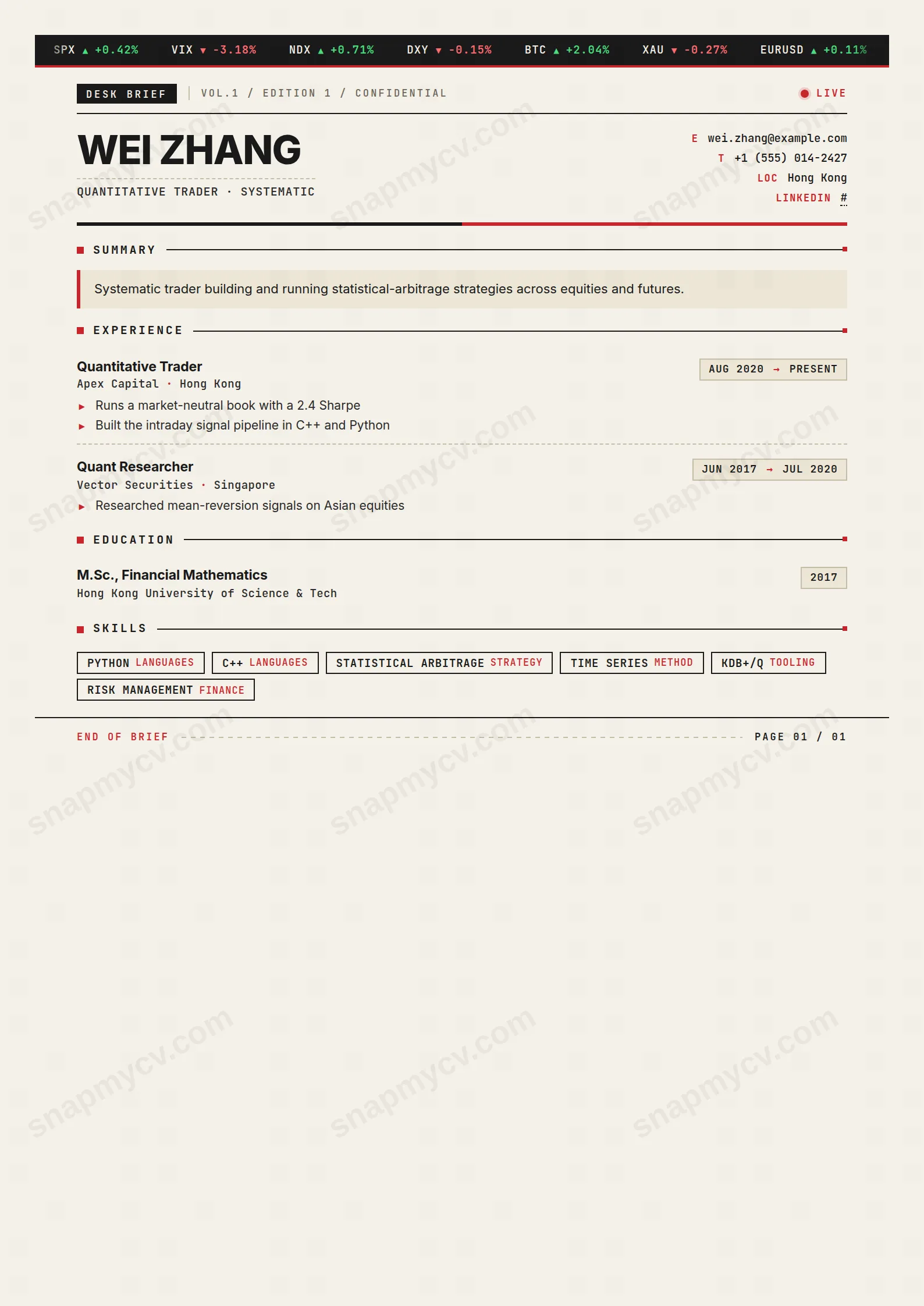
Dense, data-rich, with monospace numerics that keep P&L figures honest and aligned. Built for desks where a CV gets fifteen seconds between market events.
Best for: traders and quantitative finance professionals. Free to fill in, restyle, download as a PDF, or publish at your own SnapMyCV link.
Applicant tracking systems: Light styling. Mostly parseable but uses sidebars, columns or visual elements that may confuse stricter ATS.A template's styling never changes the advice that matters most — lead with achievements, quantify your impact, and tailor the content to each role.
New to writing a CV? Read our step-by-step CV guide and ATS tips, then come back and make this design your own.
Trader Brief borrows the visual grammar of a trading desk's daily memo and applies it to a CV with unusual discipline. A charcoal ticker strip (#1a1a1a) runs across the top, capped by a red underline and quoting SPX, VIX, BTC and UST10Y with green and red price moves, while a DESK BRIEF masthead, a CONFIDENTIAL edition line and a pulsing red LIVE dot set the tone in JetBrains Mono. The page rests on a warm paper tone (#f5f1e8) with a single ticker red (#c8252c) accent, a deliberately narrow palette that keeps the document reading like a printed tear sheet rather than a decorated template.
The typographic split is the real engineering. Your name sits huge in uppercase Inter at the top-left, grounding the page in a clean sans, while a monospace headline clipped under a dashed rule and keyed contact rows (E, T, LOC, WWW) down the right pull everything back toward the trading-floor register. Section titles carry a red square bullet and a hairline rule that ends in a red tick; experience entries use boxed date chips with a red arrow, dashed dividers between roles and red triangle bullets. The dashed END OF BRIEF / PAGE 01 / 01 footer closes the memo. Every element earns the metaphor without tipping into gimmick.
This template is genuinely right for markets people: traders, portfolio managers, quants, sales and structuring desks, brokers and anyone in front-office finance who wants a CV that signals fluency in their own language. The dense single-column grid and JetBrains Mono numerics reward hard figures, so P&L, Sharpe, AUM, basis points, hit rate and notional all sit cleanly, like columns on a risk report.
Be honest about the fit. If you are applying into conservative private banking, law, academia, healthcare or the public sector, the ticker strip and CONFIDENTIAL masthead will read as costume rather than credential, and a plainer layout serves you better. It also punishes vague, prose-heavy careers: with little quantified achievement to fill the metric-friendly grid, the design's promise goes unmet and the empty structure shows.
Treat every entry like a line on a tear sheet. Lead each experience highlight with a number and let the red triangle bullets carry short, quantified statements rather than sentences; the boxed date chips and dashed dividers already do the visual separation, so long paragraphs fight the layout. Use the summary box with its red left border for a two-line pitch, no more, and load the skills section with concrete tools and asset classes, each of which can take a small red category tag. Languages and certifications round out the lower grid nicely.
The common mistakes are over-writing and under-quantifying. Because the single column is narrow and dense, three or four tight bullets per role read far better than six loose ones, and the monospace headline wants a job title or desk name, not a mission statement. Aim for one page: the PAGE 01 / 01 footer is styled for a single-page brief, and a spilled second page dilutes the punchy, market-note effect the design is built around.
No. The SPX, VIX, BTC and UST10Y quotes, the CONFIDENTIAL masthead and the pulsing LIVE status dot are fixed styling that establishes the trading-floor tone. They are not pulled from any market feed and do not reflect your details. Your real information lives in the name, monospace headline, keyed contact rows and the standard CV sections.
Mostly, yes. The layout leans on structure more than colour, so the dashed rules, boxed date chips, square and triangle bullets and the hairline section rules all survive a black-and-white print. The ticker red (#c8252c) drops to a mid-grey and the charcoal ticker strip stays dark, so the document reads as a clean monochrome memo, though the green and red price moves in the ticker lose their distinction.


