
Warm yellow and black with playful accents for tutors and educators.
Create a free account to customize and publish this design.
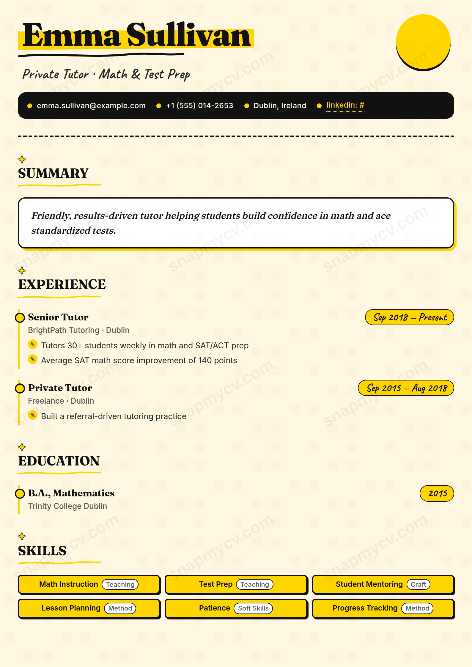
Warm yellow and black with playful accents that stay on the right side of professional. Approachable at first glance — which is precisely what parents and students are screening for.
Best for: tutors, coaches, and education freelancers. Free to fill in, restyle, download as a PDF, or publish at your own SnapMyCV link.
Applicant tracking systems: ATS-friendly. Single-column, standard section headers, parses cleanly in most applicant tracking systems.A template's styling never changes the advice that matters most — lead with achievements, quantify your impact, and tailor the content to each role.
New to writing a CV? Read our step-by-step CV guide and ATS tips, then come back and make this design your own.
Tutor Bright is built to feel friendly before you read a word. The page sits on a soft cream (#FFF7E0) rather than white, so it never glares, and a thick black bar caps the top while a bold yellow circle with a hard drop shadow sits in the corner like a peeled-and-stuck sticker. That single accent yellow (#FFD500) does almost all the colour work, kept honest by near-black ink for text, which is what stops the whole thing tipping into novelty.
The typography is a deliberate three-voice chorus. Fraunces, a chunky high-contrast serif, sets the name at 54px with a hand-painted highlighter swipe behind it and a wobbly hand-drawn SVG underline, so the top of the page has personality without shouting. Inter carries the body at a calm, legible weight, and Caveat, a handwriting face, is reserved for small human touches: dates, language levels and hobby tags. Section titles wear a small outlined sparkle, and the summary is styled as a quoted note-card floating on a yellow box-shadow. It is a single column top to bottom, which keeps the reading order obvious even with all the decoration.
The design is honest about its audience. Private tutors, classroom teachers, teaching assistants, early-years and primary educators, and music or language coaches are exactly who this fits, along with anyone selling warmth, patience and rapport to parents, schools and tutoring agencies. The sticker-book character reads as energetic and approachable on first glance, which is a real advantage when a family or a head of department is scanning applications.
Avoid it if you are chasing a senior corporate, legal, finance or academic-research role, or applying anywhere that expects restraint. The marigold circle, highlighter swipe and handwritten Caveat tags will read as too playful for a law firm or a university tenure panel, and they cannot be toned down. If your field prizes gravitas over friendliness, a plainer single-column template will serve you better.
Because the layout is loud, keep the words calm. The summary lives inside a quoted note-card, so write it as one genuine sentence that sounds like something a person would actually say, not a paragraph of buzzwords. Each experience entry hangs off a yellow timeline rail with a dotted node and bullets set in little pencil roundels, so give every role two to four short outcome-led bullets: grades lifted, pass rates, students mentored. Long dense paragraphs fight the roundels and the rail and quickly look messy.
Skills render as bold pill badges, so favour concrete subjects and methods (Key Stage 2 maths, phonics, exam technique) over vague traits like 'hard-working', which look thin inside a badge. Languages and hobbies get their own playful Caveat tags, so use them, since being personable is part of the job here. The most common mistake is over-filling: this template flatters three or four well-chosen roles and a tight skills row far more than a crammed ten-year history, because every extra entry adds another node to the rail and stretches the cheerful single column past its best length.
The section headings are conventional and the running order is a standard top-to-bottom single column, which parses cleanly, but the highlighter swipe, SVG underline, timeline rail and pill badges are visual flair that ATS software ignores since it only reads text. For a school or agency portal, paste your content into a plain-text field first and confirm every line survives in order. For emailed or printed applications the decorative look is a genuine asset rather than a risk.
It holds up better than most colour-heavy designs because the structure does not depend on the yellow. The near-black ink on cream keeps strong contrast, and the black top bar, dotted timeline nodes and pencil roundels all stay legible in grey, so the #FFD500 accents simply flatten to a light tone without breaking the layout. You lose the cheerful warmth in black and white, but nothing becomes unreadable.


