
High-energy orange-accented template for standout applications.
Create a free account to customize and publish this design.
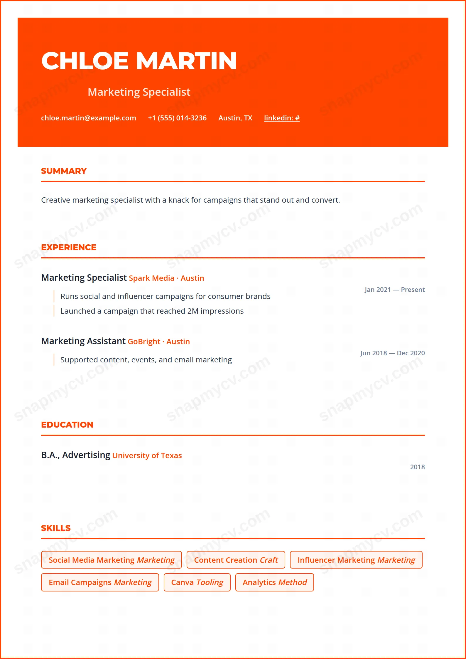
A high-energy orange accent system for applications that need to be remembered out of a pile of two hundred. Loud accent, disciplined layout — the combination that works.
Best for: applicants in creative, marketing, and consumer roles. Free to fill in, restyle, download as a PDF, or publish at your own SnapMyCV link.
Applicant tracking systems: Light styling. Mostly parseable but uses sidebars, columns or visual elements that may confuse stricter ATS.A template's styling never changes the advice that matters most — lead with achievements, quantify your impact, and tailor the content to each role.
New to writing a CV? Read our step-by-step CV guide and ATS tips, then come back and make this design your own.
Vibrant Orange stakes everything on its opening block. A full-width banner in #ff4500 holds your name in heavy uppercase Montserrat at 42px with tight letter-spacing, a softened white headline sits directly beneath, and contact details are centred inside the same orange field. The effect is a masthead that behaves like a brand logo, so a reader registers confidence before they read a single word of experience. Montserrat was chosen for exactly this reason: its geometric caps hold their weight at large sizes without looking decorative.
From there the page deliberately calms down. The body drops into a single column on white, framed by a 2px orange border that echoes the banner and keeps the eye contained. Section titles are small uppercase Montserrat in the same orange with a matching underline, while body copy switches to Open Sans for comfortable reading at length. The accent is rationed with intent, surfacing again only in the outlined orange skill badges on a pale peach fill and the soft #ffedde rule tipping every bullet. Colour does the shouting so the typography can stay quiet.
This template is built for people whose work rewards visible energy: marketers, sales and growth operators, startup generalists, event and hospitality staff, brand and community managers, and recent graduates who would rather be noticed than blend in. The oversized masthead pays off a punchy headline, so that white line under your name should state your role and value plainly rather than repeat a job title.
Be honest about where it works against you. Conservative fields that read a saturated orange banner as unserious, such as law, banking, academia, medicine and most government roles, are a poor match, and anyone submitting through a strict applicant tracking system should weigh the filled header carefully. If your strength is a long, dense track record rather than a sharp positioning line, a restrained single-accent layout will flatter you more than this one.
Treat the masthead as your hook and everything below it as evidence. Because the header already carries the visual load, keep the highlight bullets crisp and quantified, one line each, letting the #ffedde rule guide the eye down without competing paragraphs. Group related skills before you list them so the outlined badges settle into a tidy band rather than scattering across the peach fill; eight to fourteen focused badges read far better here than a sprawling cloud, and a long ungrouped list is the most common way people make this layout feel busy.
Lead with your strongest section straight after the header, usually experience or a short summary, and lean on the supported sections, education, projects, certifications, awards and languages, only where you genuinely have substance to show. Generous white space between items is what keeps the accent feeling chosen rather than loud, so resist padding thin roles to fill the page. On a single column this design sits most comfortably at one page for early-career candidates and two for seasoned ones.
The orange banner converts to a solid mid-grey block with white text, which stays legible but loses the warmth that makes the design distinctive. The outlined skill badges and pale peach fills flatten toward light grey and become subtle, so in black-and-white printing the layout leans almost entirely on the Montserrat and Open Sans hierarchy. If you know a recruiter will photocopy your CV, expect a more muted, corporate look than the on-screen version.
The underlying structure is a simple linear single column with conventional uppercase headings, which most parsers handle reliably. The risk sits in the contact details living inside the coloured header block and the skills rendering as styled badges, both of which occasionally confuse older systems. Before applying through a strict ATS, copy the exported PDF text into a blank document and confirm your name, contacts and skills all land in the correct order.


