
Sharp and authoritative template for finance and banking professionals.
Create a free account to customize and publish this design.
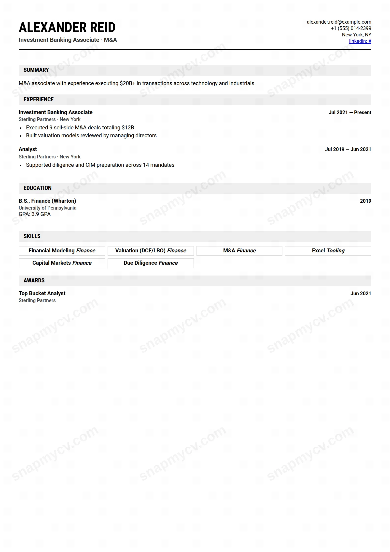
Sharp rules, tight spacing, and an authoritative monochrome voice. The finance CV equivalent of a firm handshake — brief, controlled, certain.
Best for: finance and banking professionals. Free to fill in, restyle, download as a PDF, or publish at your own SnapMyCV link.
Applicant tracking systems: Light styling. Mostly parseable but uses sidebars, columns or visual elements that may confuse stricter ATS.A template's styling never changes the advice that matters most — lead with achievements, quantify your impact, and tailor the content to each role.
New to writing a CV? Read our step-by-step CV guide and ATS tips, then come back and make this design your own.
The engine of this template is Roboto Condensed for headings paired with regular Roboto for body copy, set tight over a multi-column grid. Condensed letterforms are narrower than standard sans-serifs, so each line holds more words before it wraps, and the grid slices the A4 page into parallel tracks that stack detail vertically rather than pushing it onto a second page. The result reads like a sober deal memo: no colour, no ornament, just structured information at high density.
These choices are not decoration, they are a response to how finance recruiters actually scan. The restrained palette and businesslike hierarchy keep the eye moving through transactions, values, and credentials without visual interruption, while the disciplined grid signals the same precision the job demands. Whitespace is deliberately economical here, so the page feels full and serious rather than airy, which is exactly the tone banking and corporate finance expect.
Wall Street is built for analysts and associates in investment banking, private equity, corporate finance, accounting, and management consulting, along with students and recent graduates targeting those desks who need to compress internships, a strong GPA, and technical skills into a tight frame. If your value is measured in deal sizes, returns, and closed transactions, the condensed grid gives you room to list all of it credibly.
It is the wrong choice if your field rewards visual personality or negative space. Designers, marketers, and creatives will find the sober palette and packed columns work against them, and anyone with a thin track record will make the density look empty rather than efficient. If you have only a line or two of real experience, a more open single-column layout will flatter you more than this one.
Lead with your strongest transaction or result, because the eye lands top-left first, and let quantified lines carry the weight: deal sizes, returns, headcount, budgets, and percentages read especially well in Roboto Condensed because numbers stay legible even when set tight. Keep bullet verbs strong and front-loaded, hold each bullet to a single line where you can, and use the parallel columns to separate skills, tools, and education from the main experience narrative so the reader can find credentials at a glance.
The common mistake is treating the density as licence to add everything. Because the grid absorbs so much text, it hides bloat until the page feels heavy and undifferentiated, so ruthless editing matters more here than in any airy template. Aim for one well-edited page early in your career and no more than two later, trim any bullet that does not name a result, and resist stretching short entries to fill a column, since a half-empty track is more obvious in this layout than in a looser one.
Multi-column layouts can confuse older or stricter parsers, which sometimes read across columns and scramble the order. Run the plain-text test on your exported PDF before submitting, and for rigid application portals favour a single-column template. For emailed applications and direct sharing with recruiters the columns are fine.
Yes, and this is one of its strengths. The template carries no colour to lose, so it relies entirely on the Roboto Condensed and Roboto type contrast and the grid structure, which survive black-and-white printing and photocopying intact. What you see on screen is essentially what prints, which suits finance environments where CVs are often printed plainly.


