
Warm beige and dark green palette projecting trust for financial advisors.
Create a free account to customize and publish this design.
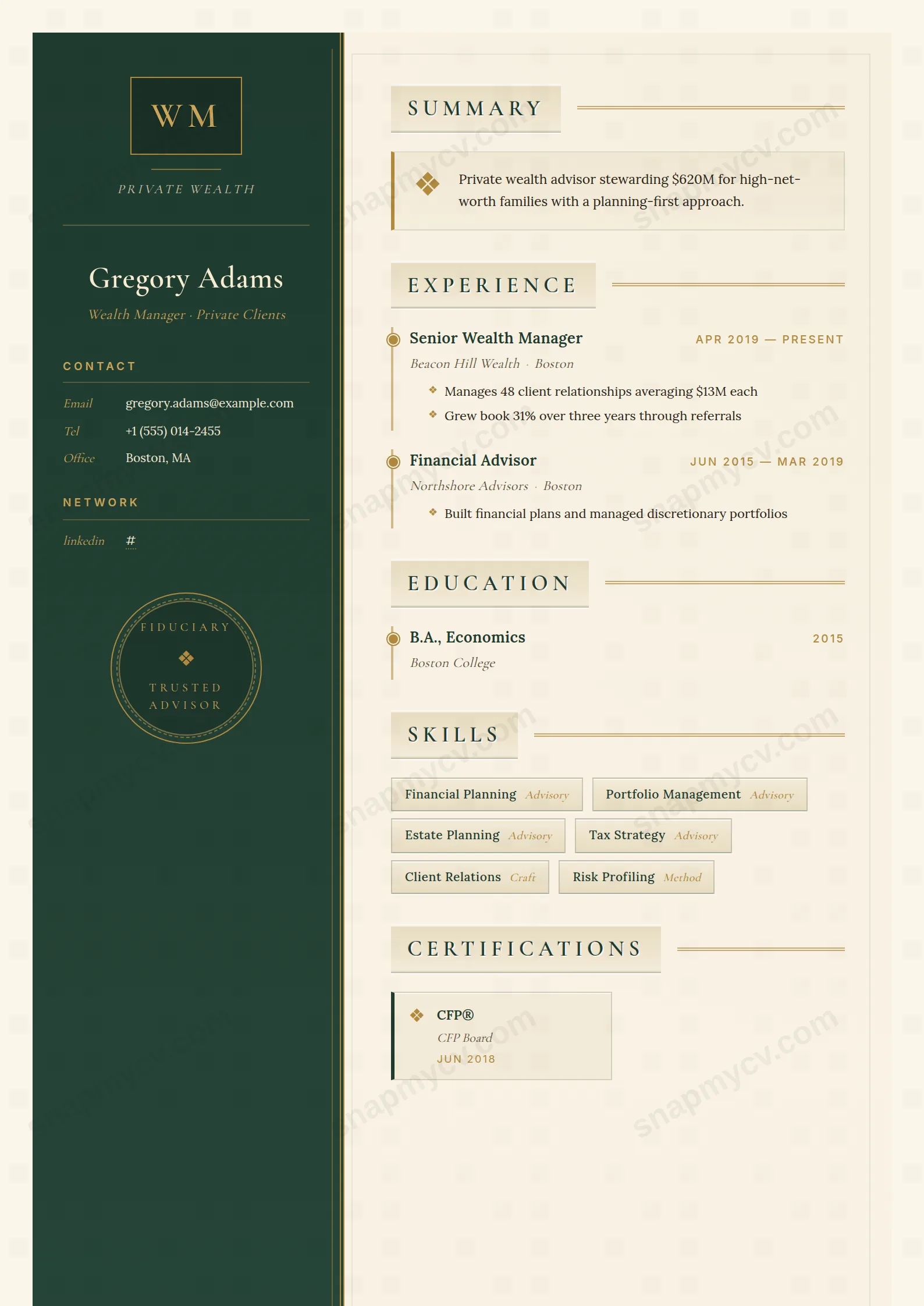
Warm beige and deep green chosen to project the thing clients actually buy: trust. AUM, certifications, and tenure are framed calmly rather than loudly.
Best for: wealth managers and financial advisors. Free to fill in, restyle, download as a PDF, or publish at your own SnapMyCV link.
Applicant tracking systems: Light styling. Mostly parseable but uses sidebars, columns or visual elements that may confuse stricter ATS.A template's styling never changes the advice that matters most — lead with achievements, quantify your impact, and tailor the content to each role.
New to writing a CV? Read our step-by-step CV guide and ATS tips, then come back and make this design your own.
Wealth Manager is built to look like a private memorandum rather than a job application. The deep forest-green sidebar fades from #1f3a2e to #2f5142 and is edged with a double gold rule and a faint inner pinstripe, framing a bordered monogram crest and a 'Private Wealth' tag set in italic Cormorant Garamond. That serif choice is deliberate. Cormorant reads as old-money and understated where a geometric sans would read as tech. The circular gold 'Fiduciary / Trusted Advisor' seal at the foot of the column functions as a wax stamp, signalling discretion before a single line of experience is read.
The main column answers the dark sidebar with a soft cream field (#faf5e8) inside a hairline border, so the page feels like heavy stock rather than screen white. Section titles are embossed on a raised beige plaque and trailed by a striped gold rule, giving clear hierarchy without loud colour. Body copy sits in Lora for warm readability, while dates and labels switch to spaced Inter caps in gold, a quiet contrast that keeps timelines legible. Roles hang off a gold-dotted timeline and skills sit in lightly shadowed badges, so the eye moves calmly down a structured, moneyed page.
This template is right for private bankers, wealth and portfolio managers, financial advisers, relationship managers, and trust or estate professionals whose credibility rests on long tenures and high-net-worth relationships. The heritage green-and-gold palette and seal motif flatter careers measured in assets under management, client retention and mandates won, and they suit senior advisers who want to look established rather than eager.
Be honest about where it works against you. If you are chasing a fast-moving fintech, a startup CFO seat or a quantitative or trading role, the ornamental crest and fiduciary seal can read as conservative or even stuffy, and a cleaner single-column layout will serve you better. Early-career applicants with thin history will also find the formal framing oversells a short story. This is a design for people who already have the track record the styling implies.
Lead with a tight three or four line summary in the drop-diamond block at the top of the cream column, then let the gold-dotted timeline carry hard numbers: AUM grown, books inherited, mandates won, compliance kept clean. Keep role headlines short so the spaced gold Inter caps and embossed plaque titles stay crisp, and write timeline bullets as outcomes rather than duties. The two-column certifications card grid, each entry marked with a gold diamond glyph, is purpose-built for CFP, CFA, FINRA or local regulatory credentials, so give it four to eight real qualifications rather than padding.
The common mistake is overfilling. This layout breathes on whitespace and the double gold rules, so a wall of text collapses the plaque hierarchy and muddies the timeline. Aim for one page, two at most, keep the skills badges to a curated dozen, and reserve the languages panel for genuine client-facing fluency. Because the sidebar is fixed and narrow, put only your name, headline, contact rows and credentials there, and let every dense paragraph live in the cream main column where Lora can hold it.
It survives better than most coloured designs. The deep forest-green sidebar renders as a strong dark grey that still separates cleanly from the cream main column, so the two-column structure and the name block stay readable. The gold rules and diamond glyphs lose their warmth and become pale grey lines, which softens the luxury cue, but hierarchy from the embossed plaque titles and the timeline dots remains intact on a black-and-white print or fax.
It is tuned for a senior single page, or two pages for a long advisory career. The narrow sidebar takes your name, contact and credentials only, while the cream column holds the summary, a gold-dotted timeline of roles and the certifications grid. Because the design leans on whitespace and the double gold rules for its calm, formal feel, packing in more than about four or five roles or a long skills list makes the plaque titles and timeline lose their crispness.


